Stunning fact: 94% of first impressions about a website are design-related! Your website’s layout isn’t just about looks—it’s a powerhouse for user experience, conversions, and brand authority. In 2025, with users demanding lightning-fast, visually compelling, and mobile-friendly sites, the hunt for the best website layouts has never been more exciting. Whether you’re a small business owner, a creative freelancer, or a marketing guru, discovering effective website layout design ideas will set your site apart from the crowd. Ready to supercharge your site with responsive page layouts, homepage layout examples, and proven landing page design tips? Let’s dive right in!
Why Website Layout Matters in 2025
- First impressions are driven by layout and visual appeal
- Responsive page layout is critical for mobile and tablet users
- Effective layouts boost navigation and conversion rates
- Trends in best website layouts 2025 emphasize clarity and speed
Your website’s layout is the digital handshake with new visitors. Within seconds, users decide if they’ll stay or bounce. A well-structured page layout design ensures your content is easy to find, your value is clear, and your brand feels trustworthy. Responsive layouts are no longer optional; they’re vital! With most web traffic now on mobile devices, your site must look flawless everywhere—desktop, tablet, or phone. The best website layouts 2025 focus on clean navigation and striking visual hierarchy, guiding users toward calls-to-action and making every click count.
Today’s users crave instant answers and smooth experiences. If your navigation is confusing or your homepage layout example feels cluttered, people will leave before you can say “refresh!” That’s why current trends lean hard into simplicity, bold imagery, and intuitive flows—making every second on your site a joy for visitors.
Essential Principles of Effective Page Layout Design
- Use grids and alignment for visual balance
- Master negative space to avoid clutter
- Establish a clear content hierarchy
- Follow the “rule of thirds” and “rule of odds” for eye-catching arrangements
Great layouts always start with grids. Grids provide a solid structure, keep your site looking polished, and make it easy to align elements. This approach instantly boosts your site’s readability and appeal. Negative space (also called white space) isn’t wasted real estate—it’s the breathing room that lets users focus on what matters. Overcrowded sites are overwhelming; generous spacing is visually soothing and helps direct attention.
Hierarchical design ensures users spot the most important content first. For example, your headline and CTA should grab attention immediately, with supporting text and images leading users deeper into your site. Applying the “rule of thirds” breaks your page into nine areas, creating natural focal points and making your design feel harmonious. The “rule of odds,” favoring groups of three or five elements, adds visual interest and balance to sections like feature highlights or portfolios.
Homepage Layout Examples That Wow
- Full-screen hero images for instant impact
- Card-based and masonry layouts for content-rich sites
- Three-column and split-screen layouts for product or service variety
- Minimalist and circle-based layouts for unique branding
If you want to make a bold statement, start with a full-screen hero image or video. This layout grabs attention and sets the tone for your brand right away. It’s perfect for visually rich businesses like travel, design, or food. Card-based layouts offer modular structure, letting you highlight multiple products, articles, or services in neat, clickable boxes. Masonry layouts shake things up by using varied box sizes—ideal for creative portfolios or image galleries.
Three-column homepage layout examples showcase a range of offerings side-by-side, making it easy for users to compare. Split-screen layouts, on the other hand, divide the page into two equal sections—fantastic for contrasting products or targeting two user segments at once. For brands eager to break the mold, minimalist layouts with bold typography or circle-based elements bring a fresh, modern feel. These unique designs stand out and can become instantly memorable for your audience.
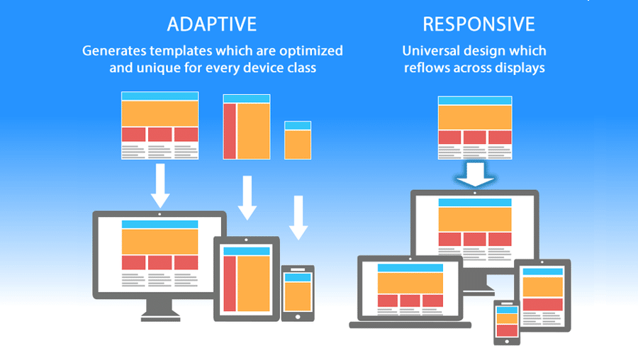
Responsive Page Layout: Making Every Device Shine
- Mobile-first design is now essential
- Flexible grids and media queries adapt to any screen
- Touch-friendly navigation enhances usability
- Testing across devices prevents layout mishaps
A responsive page layout isn’t just a box to check—it’s the backbone of user experience! Start with a mobile-first mindset, designing for smaller screens before scaling up for desktop. Flexible grids and CSS media queries allow your site to adapt beautifully, ensuring images, text, and buttons resize intelligently. Big, tap-friendly navigation and buttons make mobile browsing effortless. Don’t forget to test! Try your site on multiple devices and browsers to catch any hiccups before your users do.
Responsive design also streamlines your workflow. Instead of managing separate desktop and mobile sites, a single responsive layout keeps everything consistent. This approach saves time, reduces maintenance headaches, and guarantees every visitor sees your best side—no matter how they access your site.
Landing Page Design Tips for Maximum Conversions
- Use single-column or two-column layouts for focus
- Keep forms short and calls-to-action prominent
- Minimize distractions with streamlined content
- Leverage visual cues and testimonials for trust
Landing pages are your digital sales engines! For maximum results, stick to a focused, single-column layout. This keeps visitors’ eyes glued to your message and drives them toward your CTA. Two-column layouts are great when you want to pair a compelling image or form next to your main pitch. Keep forms brief—ask only for essential information to reduce friction.
Cut out unnecessary links or navigation that might tempt users to stray. Every word, image, and button should support your conversion goal. Visual cues like arrows, contrasting buttons, or progress bars subtly guide users through the page. Social proof, such as testimonials or customer logos, builds instant trust and reassures visitors they’re making a smart choice. When you combine these landing page design tips, your site transforms into a lead-generating machine!
Top Website Layout Design Ideas for 2025
- Asymmetrical and broken grid layouts for creative flair
- Magazine and F-shaped layouts for content-heavy sites
- Portfolio and resume layouts for personal brands
- Coming soon and text-only layouts for quick launches
Looking to break out of the box? Asymmetrical and broken grid layouts add visual energy and creativity, perfect for agencies, artists, or anyone wanting to stand out. Magazine-style layouts, with their multi-column structure, make content-heavy sites like blogs or news outlets engaging and scannable. The F-shaped pattern, inspired by how users skim web pages, places key elements along the top and left side—exactly where eyes go first!
Personal brands can shine with portfolio or resume layouts, putting your skills and achievements front and center. These designs are streamlined and easy to browse, making them ideal for freelancers and job seekers. Got a project in the works? A “coming soon” or text-only layout can quickly get your message online—no heavy design work needed. These layouts load super-fast and keep attention where it counts: on your words and mission.
How to Choose the Right Layout for Your Website
- Understand your audience’s preferences and needs
- Match layouts to your content type and goals
- Prioritize usability and accessibility
- Test and iterate for optimal results
Choosing the perfect website layout starts with your audience! Who are your users? What devices do they favor? Are they browsing for quick info, shopping, or diving into long-form content? Match your layout to both their habits and your business goals. For example, a service provider might benefit from a focused, conversion-driven landing page, while a magazine or blog thrives with a multi-column or F-shaped design.
Usability is king! Make sure navigation is obvious and that key actions—like contact or purchase—are visible without hunting. Accessibility also matters; use clear fonts, strong contrasts, and descriptive headings, so everyone enjoys your site. Finally, never be afraid to test! Gather feedback, review analytics, and tweak your layout until users are loving the journey. Iteration is how good sites become great ones!
FAQs: Quick Answers About Website Layouts
- What are the four main parts of a website layout?
- How do you plan a website layout?
- How should a website be structured?
- How do I make a simple page layout?
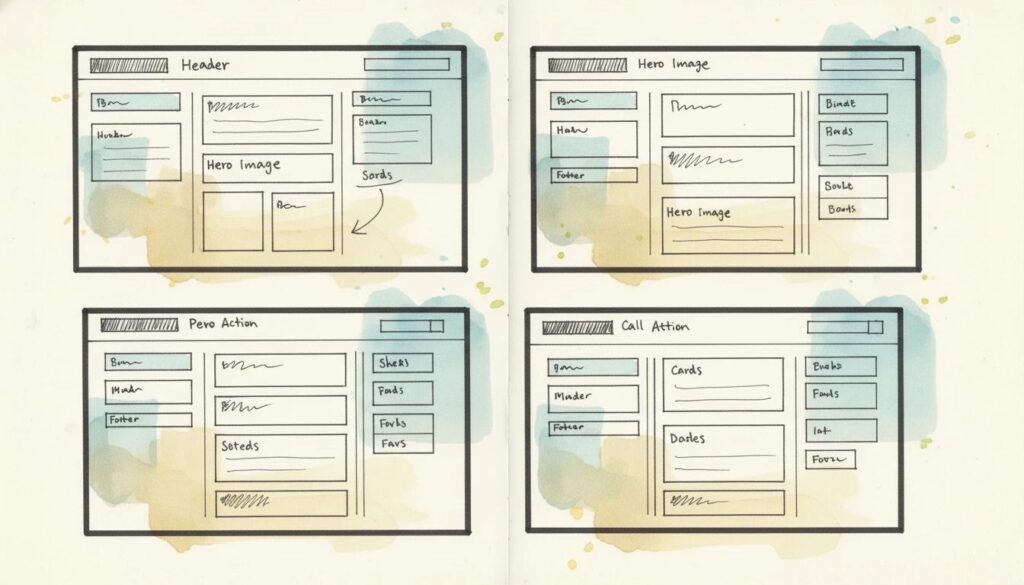
The four pillars of a website layout are the header, hero section, body, and footer. Planning begins with understanding your audience, defining goals, and using wireframes to map your site. Structure your site so it’s easy to navigate, with clear paths for users to take action. For quick builds, start with a modern website builder and choose a layout template that fits your needs—drag, drop, and you’re on your way!
Unlock Your Site’s Potential With the Right Layout
Your website’s layout is your digital storefront, your handshake, and your elevator pitch—all in one! By applying proven website layout design ideas, keeping up with the best website layouts 2025, and crafting a responsive page layout, you’ll deliver an experience that’s memorable and effective. Don’t settle for average—use bold homepage layout examples and smart landing page design tips to wow visitors and drive conversions. Now is the perfect time to review your site, experiment with new layouts, and watch your engagement soar. Let’s build something extraordinary—your dream site is just a layout away!