“Great dashboards are not just pretty—they are powerful!” That’s a mantra every product designer should live by. With businesses and apps relying more than ever on data-driven decisions, the demand for sharp, insightful dashboards is skyrocketing. Whether you’re building operational, analytical, or strategic dashboards, nailing the design is what transforms overwhelming data into instant clarity. Let’s dive into dashboard design best practices, data visualization in dashboards, and the latest UI kits for dashboard prototyping. Ready to supercharge your next project? Let’s go!
Why Dashboard Design Matters: Purpose, Types, and Essential Elements
- Dashboards provide a central hub for critical data and controls.
- There are three primary dashboard types: operational, analytical, and strategic.
- Effective dashboards include charts, tables, KPIs, filters, and clear navigation.
Dashboards act as mission control for users, bringing together the most vital information in one place. Whether it’s monitoring sales, project progress, or real-time stats, dashboards empower users to make fast, informed decisions. But not all dashboards are created equal! Operational dashboards focus on real-time status, analytical dashboards zoom in on trends and patterns, while strategic dashboards track high-level objectives and KPIs. Each serves a distinct purpose, and choosing the right type is the first step to dashboard mastery.
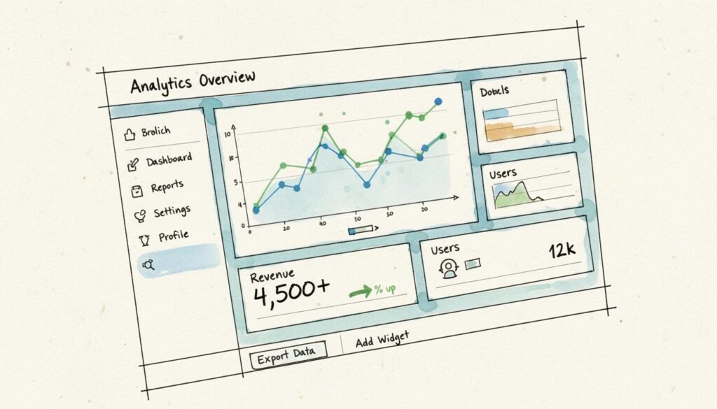
Regardless of type, several key components make dashboards shine. Charts and graphs tell stories at a glance, while tables deliver granular detail. KPIs and metrics headline the show—big, bold, and impossible to miss. Filters and controls let users customize their view, and intuitive navigation ensures they never get lost. When these elements work together seamlessly, dashboards become more than collections of data—they become action-packed, user-friendly tools.
Dashboard Design Best Practices for Maximum Impact
- Understand your users and tailor data to their needs.
- Prioritize a single-screen, at-a-glance experience.
- Use the F and Z reading patterns to guide data placement.
- Leverage white space to prevent information overload.
- Make dashboards responsive for all devices.
Epic dashboards start with knowing your users inside and out! Take time to define user personas and map out their needs. Ask yourself: What are the top five takeaways my users crave? Then, arrange your dashboard to serve up this info instantly—ideally, on a single screen. Dashboards aren’t meant to be data jungles!
Use reading patterns like F and Z to guide where you place key metrics. In left-to-right languages, users’ eyes naturally scan from top left to bottom right, so put your most crucial data front and center. Don’t be afraid of white space—it’s your secret weapon to let information breathe and keep users focused.
And with users accessing dashboards on every device imaginable, a responsive dashboard layout is non-negotiable. Design with flexibility in mind, so your data dazzles on desktops, tablets, and phones alike!
Mastering Data Visualization in Dashboards
- Choose chart types that fit your data and objectives.
- Use color and hierarchy to highlight what matters most.
- Create interactive elements for deeper exploration.
- Turn complex numbers into clear visual stories.
Data visualization in dashboards is where the magic happens! The right visuals can reveal trends, highlight outliers, and make complex data instantly digestible. Bar charts are perfect for comparisons, line graphs shine with trends over time, and pie charts nail proportions. Always match your chart type to the story you want your data to tell—this is how you captivate users and drive action.
Color is another powerhouse tool. Use it strategically to draw attention to urgent issues or critical KPIs. Just don’t go overboard—a restrained, consistent palette prevents confusion and keeps things professional. Hierarchy matters too: lead with the most important numbers, and let secondary data take a back seat.
Want to thrill your users? Add interactivity! Filters, tooltips, and drill-downs let users explore data on their own terms. When users can customize their view, your dashboard becomes not just a report—but a dynamic decision-making engine.
Operational, Analytical, and Strategic Dashboards: When and How to Use Each
- Operational dashboards track real-time data and current status.
- Analytical dashboards spotlight historical trends and patterns.
- Strategic dashboards focus on KPIs and long-term goals.
- Different dashboard types demand unique layouts and visual priorities.
Let’s break down the three main dashboard types! Operational dashboards are all about the “now.” They track live metrics—think real-time web traffic or sales. Place the most urgent numbers in prime positions, and keep it concise to prevent distraction.
Analytical dashboards, on the other hand, are the detective’s toolkit. They invite users to dig into past data, uncover trends, and spot trouble before it happens. Analytical dashboards benefit from multiple charts and deeper data views—but don’t forget to maintain clarity!
Strategic dashboards give a bird’s-eye view of performance against big-picture goals. Here, KPIs rule the roost. Present them boldly, and use supporting visuals to show progress over time. For all three types, choose layouts, visualizations, and features that match their unique missions. That’s dashboard design best practices in action!
Responsive Dashboard Layout: Power at Every Screen Size
- Responsive design ensures dashboards look and work great everywhere.
- Grid layouts and panels create structure and clarity.
- Prioritize mobile usability with touch-friendly elements.
- Test across devices to guarantee flawless performance.
Why settle for dashboards that only shine on desktop? A modern, responsive dashboard layout unlocks true flexibility and user power! Start with a grid system—it’s your foundation for aligning charts, tables, and controls in a way that feels balanced and intuitive. Use panels to group related information, and label each section clearly to guide users through the data journey.
Mobile-first thinking is crucial! Opt for larger touch targets, collapsible menus, and layouts that adapt fluidly to smaller screens. Test, test, and test again on real devices—nothing beats hands-on validation to ensure your dashboard delivers a stellar experience everywhere.
UI Kits for Dashboard Prototyping: Supercharge Your Workflow
- UI kits provide ready-made components for fast, consistent prototyping.
- Prototyping with UI kits accelerates iteration and feedback.
- Specialized kits are available for Salesforce, SAP Fiori, Oracle Alta UI, and more.
- Chart libraries simplify data visualization integration.
Designers, rejoice! UI kits for dashboard prototyping are absolute game-changers. Instead of starting from scratch, grab a kit packed with pre-built buttons, graphs, panels, and navigation elements. This speeds up your process, ensures consistency, and lets you focus on big-picture design rather than reinventing the wheel.
Many platforms offer specialized UI kits—like Salesforce’s Lightning Design System, SAP Fiori, or Oracle Alta UI. These kits mirror the look and feel of enterprise systems, making it easy to create realistic prototypes fast. Want to wow stakeholders with interactive charts? Chart UI libraries let you drag-and-drop bar, line, and pie charts right into your mockups, slashing development time.
By leveraging these resources, you can iterate quickly, gather feedback, and refine your dashboard before writing a single line of code. That’s not just efficient—it’s exhilarating!
Inspiring Dashboard Examples: Ideas to Ignite Your Creativity
- Explore vertical and horizontal navigation sales dashboards for clear data flow.
- E-learning, fitness, and home banking dashboards focus on personalization and engagement.
- Smart home and project management dashboards spotlight usability and intuitive controls.
- Responsive wireframe templates showcase flexibility and adaptability.
Sometimes, you just need a spark to get started! Check out real-world dashboard examples to see best practices in action. Sales dashboards with vertical or horizontal navigation make it easy to jump between revenue, expenses, and inventory—all with a click. E-learning and fitness dashboards put user progress front and center, using colorful graphs and personalized stats to motivate and empower.
Home banking dashboards highlight clarity, using color-coded cards and intuitive menus to make finances approachable. Smart home and project management dashboards prioritize control, letting users toggle devices or track project phases with ease. And don’t miss responsive wireframe templates—they’re perfect blueprints for dashboards that must work everywhere.
Reviewing these examples fuels new ideas! Notice how each design simplifies complex data, follows information hierarchy, and leverages purposeful visuals. Get inspired, remix what works, and take your dashboard designs to the next level!
Putting It All Together: Your Dashboard Design Checklist
- Define your dashboard’s purpose and audience.
- Select the right type: operational, analytical, or strategic.
- Prioritize essential data and arrange with clear hierarchy.
- Choose visuals that clarify, not clutter.
- Design responsively for every device.
- Use UI kits to prototype, refine, and impress!
When you combine purpose-driven layout, smart data visualization, and the right tools, you create dashboards that delight users and drive results. Keep user needs at the core, focus on clarity, and never stop iterating. Dashboard design is both an art and a science, and every detail counts. Harness these best practices, and you’ll build dashboards that turn data into action—every single time!
Ready to Elevate Your Dashboard Game?
Great dashboards transform data into insight, clarity, and action. By following dashboard design best practices, mastering data visualization in dashboards, and leveraging UI kits for dashboard prototyping, you can craft responsive dashboard layouts that wow users and accelerate decision-making. Don’t settle for ordinary—explore inspiring examples, test new ideas, and aim for dashboards that empower and excite. Let your next dashboard be the one everyone talks about. Start designing with passion and precision today!