Did you know that 94% of first impressions online are driven by your website’s design? That’s right! Before a single word is read or a button is clicked, visitors form opinions based on layout alone. If you want your site to stand out in 2025, mastering the best website layout ideas is essential. But with so many website layout examples out there, how do you know which design will help you shine? Let’s dive into the most popular website layouts of 2025 and discover how to choose the perfect structure for your next project! Whether you’re launching a portfolio, an online shop, or a personal blog, the right website layout design tips can make all the difference in captivating your audience and driving results.
Key Principles of Effective Website Layout Design
- Understand user behavior to guide visitors naturally.
- Balance aesthetics with usability for optimal engagement.
- Apply proven design theories like the rule of thirds and Gestalt principles.
- Ensure your layout aligns with your content and business goals.
Every successful website starts with a well-thought-out layout! The way you arrange text, images, and calls-to-action can lead visitors smoothly through your site or leave them frustrated and confused. For instance, users often scan pages in patterns—like Z or F shapes—so leveraging these reading habits is key. Familiar design principles, such as Gestalt psychology, help group related content and create a seamless experience. The rule of thirds is another handy trick, dividing your page for visual harmony. Above all, the best website layout ideas balance stunning looks with straightforward navigation, keeping visitors engaged from the moment they land on your homepage.
How to Choose the Perfect Website Layout
- Assess your content: images versus text, product showcases, or information delivery.
- Consider your website’s primary goals—lead generation, storytelling, or e-commerce.
- Analyze your target audience’s expectations and common browsing habits.
- Decide between classic, familiar layouts and innovative, creative structures.
Ready to pick the ideal layout? Start by thinking about what your site will showcase! If you’re launching a visual portfolio, you’ll want a layout that lets your work shine. For e-commerce, layouts that highlight products and streamline purchasing are essential. Always tailor your structure to your message—text-heavy blogs thrive with F-pattern or single-column designs, while image-focused sites excel with fullscreen or split screen layouts. Don’t forget to consider what your visitors expect! Familiarity builds trust, especially for first-time users, so sometimes sticking with popular website layouts in 2025 is the smartest move. If you’re feeling bold, asymmetrical or dynamic layouts can set your brand apart, but clarity and ease of use should always come first.
10 Best Website Layout Ideas (with Examples)
- Z-pattern layout for dynamic, visual storytelling and strong calls-to-action.
- F-pattern layout, perfect for blogs and text-rich content.
- Fullscreen image layout to make an unforgettable first impression.
- Split screen layout for showcasing dual messages or categories.
- Asymmetrical layout for a modern, energetic vibe.
- Single column layout for simplicity and linear browsing.
- Box-based (grid) layout for organized, modular content.
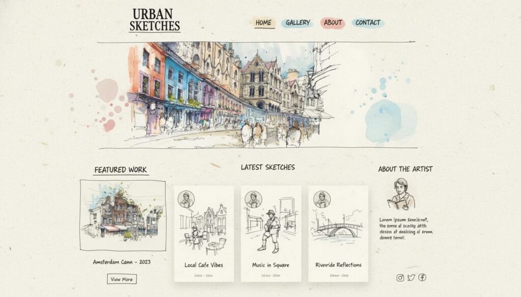
- Cards layout for flexible, mobile-friendly design.
- Magazine layout for news sites and content-heavy platforms.
- Horizontal strips layout to break up content visually and enhance scrolling.
Let’s explore these website layout examples and see how each shines! The Z-pattern layout is your go-to for visually impactful homepages or landing pages. By placing key elements along the Z-shaped path, you lead visitors from your logo to navigation and down to your main offer—fantastic for conversions! The F-pattern layout thrives where text is king, guiding readers naturally from headlines to body copy, perfect for blogs and news feeds.
If you want to grab attention instantly, nothing beats a fullscreen image layout. Feature a stunning photo or video with a concise message, and watch visitors dive deeper into your site. The split screen layout is ideal for brands with dual services or audiences—think “Shop Men” vs. “Shop Women” in e-commerce. For brands seeking a modern look, the asymmetrical layout breaks the mold and keeps eyes moving across the page. If you prefer clarity and ease, the single column layout keeps content linear and accessible, especially for mobile users.
Box-based and cards layouts both use modular blocks. Boxes offer a clean, grid-like appearance, super for portfolios or product galleries, while cards are perfect for blogs, vlogs, or e-commerce thanks to their responsive nature. The magazine layout excels when you need to organize lots of content—think news, articles, and features—while the horizontal strips layout breaks content into bold, full-width sections, keeping users scrolling for more!
Website Layout Design Tips for 2025
- Prioritize mobile responsiveness and fast loading times.
- Maintain visual consistency with colors, fonts, and spacing.
- Use strong hierarchy—headings, subheadings, and calls-to-action should stand out.
- Leverage white space to prevent clutter and increase readability.
- Test different layouts for usability and conversion rates.
Let’s supercharge your site! In 2025, there’s no room for sluggish, cluttered layouts. Responsive design ensures your website looks incredible on every device, from giant monitors to tiny smartphones. Consistency is key—stick to a harmonious color palette and font family so your brand feels trustworthy and polished. Use bold headings and clear calls-to-action to make navigation a breeze. White space isn’t empty—it’s powerful! It draws the eye, adds elegance, and makes content easy to digest. And don’t just guess—test! Use analytics and user feedback to discover which layouts keep visitors coming back and which need a tweak.
Popular Website Layouts in 2025: Trends and Inspiration
- Minimalist designs with generous white space and bold typography.
- Dynamic grids and card layouts for content-rich platforms.
- Interactive elements like parallax scrolling and animated transitions.
- Personalized navigation for unique user journeys.
- Visual storytelling using large images and short copy.
What’s trending this year? Minimalism is everywhere—sites are cutting the clutter and making each word and image count. Dynamic grids and cards bring order to sprawling content, making even complex sites feel accessible. Interactive elements such as parallax scrolling or subtle animations add excitement and keep users engaged. Navigation is getting smarter, offering tailored paths based on user preferences or past behavior. Above all, brands are embracing visual storytelling, using big, beautiful images paired with punchy text to connect emotionally with visitors. If you want inspiration, look to leading design platforms and portfolios—they’re setting the pace for what’s next!
How to Analyze Website Layout Examples for Your Own Project
- Study layout structures from top brands and competitors.
- Note which layouts make navigation effortless and engaging.
- Observe how key information and calls-to-action are positioned.
- Identify design elements that reflect your brand’s personality.
Ready to find your perfect match? Start by exploring popular websites in your industry. Pay close attention to how content is organized—do they use a grid, cards, or a bold hero image? Which layouts make you want to explore further? Notice where menus, buttons, and important information appear; these placements aren’t random. Effective layouts gently nudge visitors toward actions you want them to take. Finally, let your brand’s personality shine! If you’re playful and creative, an asymmetrical or dynamic layout might fit. For a more formal, information-heavy site, a grid or magazine layout could be just right.
Bringing It All Together: Your Ideal Website Layout Awaits!
- Summing up the top 10 layout styles and their best use cases.
- Embracing user habits for seamless navigation and engagement.
- Experimenting to find the design that fits your brand and goals.
- Taking action with energy and creativity—your website journey starts now!
Choosing the right layout is more than just following a trend—it’s about understanding your audience, your content, and your goals. Whether you’re drawn to the classic Z-pattern, the clean single column, or a cutting-edge asymmetrical design, there’s a layout out there waiting to make your site shine! Don’t be afraid to experiment, get feedback, and tweak your design until it feels just right. The best website layout ideas combine creativity, usability, and a dash of boldness—so dive in, get inspired, and watch your vision come to life. Ready to build the website of your dreams? The perfect layout is just a click away—let’s make your digital presence unforgettable!