Color is the secret sauce of unforgettable web design, and 2025 is turning up the volume in style! According to recent studies, people decide whether they like a website in just 50 milliseconds—and color is the first thing they notice. As brands and creatives look for ways to stand out, 2025 website color palettes are shifting in exciting directions. From the influence of the Pantone 2025 color of the year to fresh, modern brand color trends, this year’s palettes blend softness with boldness. Whether you’re launching a new brand, revamping your site with Showit website templates, or experimenting with DIY Canva brand templates, knowing which palettes are trending can supercharge your design choices and help you make a lasting impact online.
Why 2025 Website Color Palettes Are Shifting
- Softer, balanced colors are replacing last year’s vibrant neons.
- Nature-inspired tones like ocean blue, forest green, and earthy pinks are everywhere.
- Color experts recommend rich, restful palettes for a sense of comfort and reassurance.
After years of neutral minimalism and a burst of bold, playful colors in 2024, the pendulum is swinging again! In 2025, we’re seeing gentle, balanced hues that feel grounded and calming. Designers and brands are drawing inspiration from nature’s most soothing colors—think lush greens, tranquil blues, and warm, earthy tones. This move toward subtlety doesn’t mean color is disappearing; instead, it’s about creating harmony and reassurance during uncertain times. Top color authorities are pairing soft, elegant pinks with breezy blues, producing palettes that radiate both warmth and serenity. These modern brand color trends aren’t just beautiful—they’re strategic, helping brands signal comfort and approachability.
The Power of Color in Branding and Web Design
- Color evokes emotion and shapes first impressions in seconds.
- Consistent palettes boost brand recognition and trust.
- Strategic use of trending colors can attract new audiences and keep your brand fresh.
Never underestimate the influence of color! The right palette can spark joy, instill calm, or energize visitors instantly. For example, blue often signals trust and tranquility, while yellow and orange energize and uplift. Green conjures feelings of growth and freshness. Brands know this—just think of the iconic red of Target or the calming blue of social media giants. Choosing a thoughtful color palette for your website is about more than just aesthetics; it’s about creating a memorable, emotional connection with your audience. With the surge of modern brand color trends in 2025, updating your palette is a powerful way to keep your digital presence fresh, relevant, and engaging.
Should You Update Your Website Colors to Match 2025 Trends?
- Decide if your current palette attracts your ideal audience.
- Experiment with trending colors on select elements before a full rebrand.
- Use softer or richer tones to refresh your look without losing brand recognition.
Thinking about a palette refresh? Consider your goals before diving in! If your current colors no longer attract your dream clients, or you want to appeal to younger, trend-savvy audiences, now’s the perfect time to explore the latest palettes. Updating doesn’t always mean a total overhaul. Dip your toes in by testing trending 2025 shades on headlines, buttons, or social graphics. Even subtle tweaks—like swapping out a background or accent color—can breathe new life into your brand. Remember, the goal is to balance personality with modern appeal. Whether you’re a photographer, boutique owner, or influencer, experimenting with these modern brand color trends can help your business stand out while staying true to your roots.
Spotlight: 2024 Colors of the Year
- Pantone’s 2024 Color of the Year: Peach Fuzz
- Benjamin Moore’s 2024 pick: Blue Nova 825
- Dutch Boy’s 2024 favorite: Ironside
- Sherwin-Williams’ 2024 star: Upward
Every year, color experts unveil their top picks, setting the tone for design across industries. Peach Fuzz, the Pantone 2024 color of the year, is an inviting, tranquil peach that radiates warmth and compassion. Pantone describes it as bridging youthful energy with timeless elegance—what a winning combo! Meanwhile, Benjamin Moore’s Blue Nova 825 brings a comforting, starry blue to the forefront, perfect for adding depth and intrigue. Dutch Boy’s Ironside is a deep, forest green that creates a sense of sanctuary, while Sherwin-Williams’ Upward is a breezy blue designed to infuse spaces with peace. These colors set the stage for the year’s must-have palettes, inspiring designers everywhere to create spaces and brands that feel both modern and comforting.
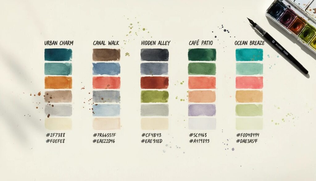
17 Trending Website Color Palettes for 2025
- Pantone 2024 Color Palette: Soft peach with earthy tones for a balanced, sophisticated look.
- Color Me Coral Palette: Warm corals, mature pinks, and burnt orange accents.
- Lavender Haze Palette: Sweet purples and soft greens—perfect for creative and child-focused brands.
- Benjamin Moore Palette: Starry blue and sky blue paired with rustic orange and light neutrals.
- Spring Forward Palette: Golden yellow, pale green, emerald, and creamy neutrals.
- Millennial Pink Palette: Feminine pinks and lavender with a buttery yellow neutral and turquoise accent.
- Feeling Fresh Palette: Vibrant forest greens, soft grays, and honey brown accents.
- Tones on Tones Palette: Warm, inviting neutrals in the same color family for a chic feel.
- Dutch Boy Palette: Nautical greens and blues balanced by soft creams.
- Study Hard Palette: A spectrum of browns and neutrals for a cozy, grounded look.
- Loving You Was… Palette: Balanced pinks and reds for warm, spicy energy.
- Holding Out For Spring Palette: Pastel lavender, fresh green, and a tangerine accent.
- Country Club Chic Palette: Oak greens, soothing blues, and neutral browns.
- Palm Beach Aesthetic Palette: Classy tropical greens, rosy pinks, and warm neutrals.
- Sherwin Williams Palette: Delicate blue, deep blue, creams, and a warm accent.
- Warm & Earthy Palette: Rich earth tones and calming neutrals for a restful vibe.
- Italian Countryside Palette: Burgundy, nighttime blue, and light, refreshing neutrals.
Ready to level up your design game? Here are the top palettes that are captivating designers and brands this year! The Pantone 2025 color palette pairs the softness of Peach Fuzz with earthy accents, delivering sophistication with a playful edge. For those craving warmth, the Color Me Coral palette brings depth with mature pinks and burnt orange. Lavender Haze is a dream for creative businesses, blending gentle purples and fresh greens, while Benjamin Moore’s palette offers starry blues and rustic orange for dramatic impact.
Spring Forward and Millennial Pink palettes are perfect for brands wanting a fresh, energetic feel. If you love nature-inspired vibes, Feeling Fresh captures forest greens and honey browns that evoke the Pacific Northwest, while Tones on Tones updates classic neutrals with warmth and style. The Dutch Boy palette is ideal for preppy, nautical brands, and Study Hard wraps your website in cozy browns and neutrals. Loving You Was… brings in spicy reds and balanced pinks for a pop of personality, and Holding Out For Spring delivers pastel florals with a zesty tangerine twist.
Country Club Chic and Palm Beach Aesthetic palettes are all about sophistication and understated glamour, featuring greens, blues, and inviting neutrals. Sherwin Williams’ palette harnesses the power of delicate blue and warm accents for a restful, modern look. For those seeking grounded, timeless elegance, Warm & Earthy and Italian Countryside palettes offer rich shades and light neutrals that create a sense of place and history. With so many options, there’s a palette for every brand and website vision in 2025!
How to Use 2025 Color Palettes On Your Showit or Canva Website
- Start by applying new colors to buttons, headlines, and backgrounds for maximum impact.
- Test palettes in select sections before a full redesign.
- Leverage easy-to-customize Showit website templates or DIY Canva brand templates for seamless updates.
Feeling inspired to try a fresh palette? It’s easier than you think! Begin by updating the colors of your most visible elements—think navigation bars, buttons, or hero sections. This approach lets you test out a palette and see how it feels without a full overhaul. Showit users will love how effortless it is to update colors using ready-made templates, while Canva fans can experiment with modern brand color trends using drag-and-drop DIY brand templates. Remember to keep your palette consistent across all brand touchpoints, from your website to your social media graphics, for a cohesive, professional look.
Don’t be afraid to experiment! Even swapping a single accent color can refresh your entire brand identity. If you’re not sure which palette fits best, try a few out in Canva or Showit and see how your content comes alive. These tools make it simple to iterate, ensuring your website always feels modern and on-brand.
Tips for Choosing the Right Color Palette for Your Brand
- Identify your brand values and the emotions you want to evoke.
- Check out competitors to spot gaps and opportunities for differentiation.
- Consider color psychology, but trust your instincts and personal taste.
- Use online resources and tools to preview palettes in action.
The best color palette is the one that reflects your brand’s personality and resonates with your target audience! Start by thinking about your brand values—do you want to appear bold and energetic, or calm and approachable? Look around at competitors to see which hues are overused and which colors could help you stand out. While color psychology offers helpful guidelines, your personal preferences matter, especially if your brand is a true reflection of you. Tools like Canva and Showit make it easy to test palettes before committing, so play around and see what feels right. Trust your gut and have fun with it—your audience will feel your excitement through your brand’s colors!
2025 Website Color Trends: Your Key Takeaways
- Color trends in 2025 celebrate balance, comfort, and vibrant pops of personality.
- Nature-inspired palettes and the Pantone 2025 color of the year are driving web design innovation.
- Adopting modern color palettes can instantly refresh your brand and attract new audiences.
2025 is a thrilling year for website color palettes! Designers and brands are embracing balanced, nature-inspired palettes that feel both modern and comforting. Whether you’re using Showit website templates, DIY Canva brand templates, or building from scratch, there’s never been a better time to experiment with trending colors. From Peach Fuzz to Blue Nova and beyond, this year’s palettes invite you to tell your brand story with confidence and style.
Don’t just follow the trends—make them your own! Dive into these modern brand color trends and watch your website come alive. Ready to take the leap? Try out a few of these palettes on your next design project and see the magic for yourself. The perfect palette is waiting for you—let’s make 2025 your most colorful year yet!