Did you know that the average human makes roughly 35,000 decisions per day? Astounding, isn’t it? Among those split-second choices—like whether to hit snooze (again) or to finally give kale a chance—lies a particularly life-altering one: whether or not to stay on your homepage. In a universe packed with endless website layout templates and attention spans that make goldfish look focused, designing an effective homepage is less about artistry and more about survival. If your homepage doesn’t immediately dazzle, inform, and guide, your visitors will vanish faster than you can say “404 error.” Let’s dive headfirst into the art and science of crafting a homepage that not only grabs eyeballs but gently (and sometimes not-so-gently) guides them where you want them to go.
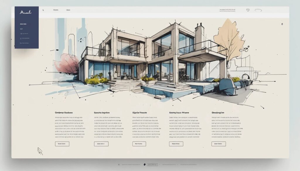
8 Essential Features of an Effective Homepage Design
- Clear, concise headline that instantly communicates your value
- Subheadline offering more detail and clarifying your offer
- Irresistible call to action, positioned for maximum visibility
- Consistent website branding with a memorable logo
- Captivating imagery that supports your message
- Homepage navigation best practices for seamless user flow
- Trust signals to build credibility
- Benefit-focused content instead of just features
Let’s face it: your homepage is your digital handshake, and nobody wants to shake hands with a limp fish. Start with a headline that answers the burning question, “What do you actually do?”—in less time than it takes to regret your last haircut. A subheadline should follow, not to repeat what you just said (heaven forbid redundancy), but to clarify how you solve your visitor’s most pressing problem. If you can’t summarize your entire business in two sentences, congratulations—you’re in good company with every government agency’s website ever.
Now, don’t hide your call to action (CTA) somewhere only Sherlock Holmes could find. Place it front and center, use power words, and don’t be afraid to exaggerate its importance. “Sign up now and change your life!” may sound grandiose, but hey, who doesn’t want their life changed by a button? For inspiration, peruse call to action examples from leaders like Shopify or Basecamp—they practically invented the art of the clickable siren song.
Next up is branding. Your logo should be more than a generic clipart of a swoosh or an abstract squiggle. Think of your branding as your website’s perfume—ideally memorable, never overpowering, and certainly not reminiscent of a high school locker room. Use color, typography, and logo placement with intention. For practical website branding tips, study icons like Apple, whose bitten apple is more recognizable than most world leaders.
But let’s not get too text-heavy; that’s a rookie mistake. Images are the unsung heroes of homepage design, communicating mood and professionalism faster than you can say “stock photo.” Just don’t use images that look like they were taken during the early days of the internet—unless, of course, your brand is “Ironic 1998.”
Your navigation bar is the homepage equivalent of road signs on a highway—make it confusing, and you’ll send your visitors into a rage spiral. Stick to homepage navigation best practices: keep it visible, logical, and free of cryptic labels. If your grandma couldn’t find the “Contact” page, you’re doing it wrong.
Trust is currency online. Include trust signals—testimonials, client logos, or security badges—so visitors know you’re not just an elaborate scam run from a mysterious basement. And finally, don’t just list features, list benefits. Nobody buys a drill because they crave the sensation of drilling; they buy it for the holes. Your content should always answer, “What’s in it for me?”
Homepage Layout Templates: Picking the Right Style for Your Brand
- Bold, image-driven layouts for ecommerce and visual-centric brands
- Text-focused, informative layouts for service providers
- Minimalist designs for style and mobile-first experiences
- Portfolio-style templates for creatives
- Balanced layouts for businesses needing equal parts text and visuals
Not all homepages should look like a Picasso painting after a triple espresso. The best website layout templates are tailored to your brand’s personality—because a lawyer’s homepage shouldn’t look like a cupcake bakery (unless, of course, they’re the sweetest lawyer in town). If you’re in ecommerce, a bold, image-centered layout with multiple CTAs—think ASOS—grabs attention and guides shoppers to the right aisle. A service provider, meanwhile, needs a more text-driven template, à la Trello, where clarity reigns supreme and you don’t need a Rosetta Stone to understand what’s on offer.
Minimalist layouts—heavy on whitespace, light on text—are perfect for brands that want to exude sophistication (or just can’t be bothered to write paragraphs). If you’re showcasing your creative genius, a portfolio-style homepage lets your work do the talking. And for those who straddle the line between visual and verbal, a balanced layout ensures neither your images nor your message gets lost in translation. The right template is your launchpad—don’t settle for the digital equivalent of shag carpet and wood paneling.
Homepage Navigation Best Practices: Don’t Make Them Play Hide and Seek
- Limit top-level navigation to essentials
- Group related links logically
- Use clear and concise labels
- Ensure mobile responsiveness
Navigation isn’t the time for creativity—save your “About Our Synergy” page for the company picnic. Limit your top-level navigation to what actually matters: Home, About, Services, Contact, maybe a blog if you’re feeling ambitious. Group related links together so users don’t have to embark on an archaeological dig for your pricing. Labels must be clear; “Our Story” is charming, but “About Us” is direct. And if your navigation bar disappears on mobile or morphs into a cryptic hamburger menu that even fast food fans can’t decipher, your bounce rate will shoot higher than a cat meme on social media.
Call to Action Examples: The Art of the Click
- Position CTA buttons above the fold and repeat as needed
- Use action-oriented, benefit-driven language
- Make CTAs visually distinct
- Test variations for maximum conversion
A call to action that blends in is about as effective as a camouflage chameleon at a paintball match. Place your CTAs where they can’t be missed: above the fold, in the middle, or wherever your visitors’ eyes naturally land. Don’t use bland instructions like “Submit.” Instead, channel your inner hype-person: “Get Started Free,” “See the Magic,” or “Join the Revolution.” Make your CTA buttons big, bold, and impossible to ignore—think Vegas neon, but less likely to induce a headache. And never settle: test different phrasings and placements until your click-through rates make you the envy of your competitors (and perhaps of your past self, too).
Website Branding Tips: Stand Out or Fade Away
- Keep logo and brand elements consistent on every page
- Choose a color palette and stick with it
- Maintain a unique tone and voice throughout your copy
- Invest in professional logo design
Your branding is your website’s DNA. A mismatched logo or color scheme is the online equivalent of wearing socks with sandals—memorable for all the wrong reasons. Make sure your logo is visible, your colors are harmonious, and your fonts are readable (Comic Sans has never made anyone look professional, ever). Consistency is key; your About page shouldn’t look like it was designed by your cousin who just discovered gradients. Use website branding tips from industry leaders and don’t be afraid to consult professional designers or logo makers if your own skills are limited to MS Paint.
Common Homepage Pitfalls: What to Avoid Like the Plague
- Cluttered layouts that overwhelm visitors
- Long-winded lists of features with no clear benefits
- Overuse of jargon and technical language
- Poor mobile optimization
- Unreadable fonts and wild color choices
Some homepages seem designed to repel visitors. Clutter is a surefire way to send users back to Google, so embrace whitespace like it’s your long-lost twin. Nobody wants to scroll through 47 features—distill what matters, and create a separate page for the rest. Unless your target audience is rocket scientists, avoid jargon that requires a decoder ring. Your site must be mobile-friendly; half your visitors will be on their phones, and if your layout looks like a jigsaw puzzle, they’ll bounce faster than a bad check. And please, pick fonts and colors that don’t make your visitors question their eyesight.
The (Not-So-Mythical) Fold: Above and Beyond
- Prioritize key content above the fold
- Encourage scrolling with visual cues
- Recognize that users are willing to scroll—if you give them a reason
The legend of the fold has terrified web designers for years, as if users would spontaneously combust if forced to scroll. But the truth is, people do scroll—if you entice them. Place your most important info and CTAs above the fold, but don’t fear what lies below. Think of it as your homepage’s basement—if you put something interesting down there, people will come. Use arrows, images, and whitespace to invite exploration, and remember: if your content is engaging, users will stick around, fold or not.
Real-World Homepage Design Examples: Inspiration Without the Imitation
- Study industry leaders for proven homepage design strategies
- Analyze competitors (and their mistakes)
- Leverage ready-made templates to accelerate your own design
Why reinvent the wheel when you can borrow the Ferrari? Browse the homepages of industry leaders—study their headlines, navigation, imagery, and trust signals. Notice how Slack uses images to reinforce its brand, or how Dunkin’ balances visuals and copy to whet appetites and build trust. Learn from your competitors’ stumbles—nothing drives a lesson home like a homepage that looks like it was last updated during the dial-up era. For the time-strapped or design-challenged, website layout templates are your best friend: customize, iterate, and launch with confidence.
Summary: The Secret Sauce of an Effective Homepage
- Communicate your value instantly with sharp messaging
- Guide users naturally with clear navigation and CTAs
- Build trust and connection through branding and social proof
- Continuously test, update, and refine your homepage
Building an effective homepage design isn’t a one-and-done affair—it’s an evolving masterpiece, a living organism, and yes, sometimes a stubborn mule. The best homepages blend clarity with personality, guiding users from “What is this?” to “Take my money!” faster than you can say “bounce rate.” Don’t be afraid to stand out, test bold ideas, and let your brand’s voice shine through. Whether you’re using hand-crafted layouts or leveraging modern website layout templates, remember: your homepage is your virtual front door. Make it so inviting, even the most jaded scroller can’t help but come in, stay a while, and—who knows—maybe even click that call to action you so cleverly placed.
Ready to banish bounce rates and turn your homepage into a conversion engine? Start testing these features, explore real-world call to action examples, and put these website branding tips into practice. The digital world is waiting—make your homepage the place everyone wants to land.