According to some very scientific (read: Instagram poll) research, the average person spends more time picking a website color palette than they do choosing a houseplant—yet the houseplant inevitably dies and the website lives on. Color isn’t just decoration; it’s a mood, a statement, a non-verbal TED Talk on your brand’s entire personality. Welcome to 2025, where “muted” is out, and “I woke up like this, but with a Pantone-approved glow” is in. Whether you’re a designer, a modern brand builder, or just someone who thinks Benjamin Moore Blue Nova 825 sounds like it could be Elon Musk’s next child, the 2025 website color palettes are here to demand your attention (and possibly your devotion). Let’s paint the digital town—ironically, of course—with the most trending color palettes ruling the web right now.
Why 2025 Website Color Palettes Are Breaking the Internet (And Your Preconceived Notions)
- Soft, balanced colors are replacing the neon riot of previous years.
- Nature-inspired hues like ocean blues and forest greens are trending.
- Experts predict pinks and blues (yes, even post-Barbie) are here to stay.
- Rich, gentle tones offer comfort amid turbulent times.
Let’s face it: last year’s color trends looked like a unicorn exploded on every startup’s landing page. But now, 2025 website color palettes are all about a return to sanity—well, as sane as you can get when your “mood board” is basically a digital spa. Soft pinks, breezy blues, and grounded earth tones are everywhere, thanks to the world’s collective desire for calm (and, possibly, to offset the existential dread of endless election cycles).
Brands like Sézane are embracing this shift with warm, restful colors, while Lululemon is giving hot pink a nap and waking up with a soothing blush. We’re seeing nature’s palette—think ocean, forest, and “please let me work from a cabin in the woods” brown—making its way onto screens. Even the experts are in on it: warm pinks aren’t going anywhere, but they’re pairing up with tranquil blues for a look that says, “I’m approachable, but I still have impeccable taste.”
The Psychology of Color: Why Your Website Palette Actually Matters
- Colors trigger specific emotions—blue for serenity, yellow for energy, green for freshness.
- Brand recognition is often tied to color (Target red, anyone?).
- The same hue can evoke different vibes depending on brightness and saturation.
- Modern brand color palettes influence first impressions far more than your witty tagline.
Let’s not pretend color is just “nice to have.” The right palette can make your brand unforgettable—or, at the very least, more memorable than the time you wore red in Target and fielded questions about bathroom locations. Blue calms. Yellow energizes. Green feels fresh, organic, and maybe just a bit superior in a farm-to-table way.
But it’s not just about the color itself. The intensity matters. A punchy purple screams “let’s party,” while lavender whispers, “I’ll be over here journaling about my feelings.” The point? Your color choices are sending signals whether you realize it or not, and with the new wave of modern brand color palettes, even your digital buttons are either inviting clicks or quietly sabotaging your conversion rates.
Should You Update Your Website Color Palette for 2025?
- Refreshing your palette can attract your ideal client—if your current one isn’t doing the trick.
- Modern color palettes appeal especially to younger audiences (hello, TikTok generation).
- You can dip a toe into trends without a total brand overhaul—subtle accents work wonders.
- Soothing doesn’t mean pastel; rich yet calm hues are the new “it” girl.
Let’s be honest—most brands update their website color palettes about as often as they update their LinkedIn profile photo: not nearly enough. If your color scheme is still clinging to 2019’s greige, it might be time for a change. A modern palette can make you irresistible to the clients you actually want (not the ones who think paying in “exposure” is a viable business model).
If you’re not ready for a full rebrand, try weaving in 2025’s trending colors in small doses—a button here, a headline there. The magic happens in the details. And remember, soothing doesn’t mean you’re stuck living in a pastel wonderland. Today’s palettes are about rich, layered tones that feel both fresh and established. Even if you’re running a newborn photography business, you don’t have to drown in baby blue; a balanced, gentle palette can make you look on-trend without losing your unique voice.
Pantone 2025 Color Trends: Peach Fuzz and Its Many Moods
- Pantone’s Color of the Year is Peach Fuzz—a tranquil, welcoming peach.
- Peach Fuzz plays well with both earthy and bold accent hues.
- This color offers a “tactile embrace”—because who doesn’t want to be hugged by a website?
- Versatile enough to be a primary, neutral, or accent color.
If you thought Pantone would declare “Neon Nightmare” as the 2025 color of the year, think again. Peach Fuzz is here, described as a peach so soft it practically apologizes for being on your screen. It’s uplifting, welcoming, and the digital equivalent of a warm hug—minus the awkward side pat.
Pantone’s executive director calls it a bridge between “the youthful and the timeless.” In other words, it’s the color your grandma and your favorite Gen Z influencer can both agree is “cute.” And if you’re worried about versatility, don’t be. Peach Fuzz can headline your palette, anchor your backgrounds, or simply pop up as a CTA button that whispers, “Click me, you know you want to.”
Benjamin Moore Blue Nova 825: The Unexpected Star of Modern Brand Color Palettes
- Blue Nova 825 is Benjamin Moore’s Color of the Year—an alluring, balanced mid-tone blue.
- It evokes comfort, intrigue, and classic reassurance (basically, your website’s therapist).
- Works as a primary or accent color, especially for digital designs.
- Pairs beautifully with warm neutrals and rustic oranges for balance.
Just when you thought your only blue options were “corporate navy” or “dorm room teal,” Benjamin Moore Blue Nova 825 drops in like the sophisticated cousin who always brings the best wine. It’s the kind of blue that says, “Sure, I’m calming, but I also have a secret past.”
Benjamin Moore’s color marketing director described it as balancing depth and intrigue with classic appeal. Use it for buttons, headlines, or anywhere you want attention—without screaming for it. Pairing it with soft neutrals and a touch of rustic orange gives your website that elusive “I tried, but not too hard” vibe. Pro tip: ground these bold colors with plenty of white space, unless you want your brand to feel like it’s shouting through a megaphone at a meditation retreat.
Nature-Inspired Palettes: Dutch Boy Ironside and Sherwin-Williams Upward Lead the Way
- Dutch Boy’s Ironside offers a deep forest green for sophisticated comfort.
- Sherwin-Williams’ Upward brings a breezy blue designed to infuse calm and clarity.
- Both colors pair well with earthy neutrals and rich accent tones.
- Greens and blues dominate 2025, echoing trends on fashion runways and interiors.
If you’re tired of pretending “sage” is the only green, 2025 has a treat for you. Dutch Boy Ironside is a forest green so deep it could hide your existential crises. It’s all about sanctuary, comfort, and the sort of sophistication that says, “I own a library, or at least a Kindle.”
On the other end, Sherwin-Williams Upward is a blue that practically floats off the page. Pair it with soft earth tones and you’ll have a color scheme that says, “I meditate daily and my inbox is at zero.” Both greens and blues are having a fashion moment, too—so your website will be runway-ready, even if your sweatpants aren’t.
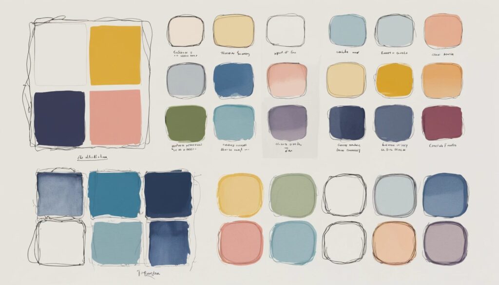
17 Trending Website Color Palettes for 2025: Your Swipe-Right List
- Pantone 2025 Color Palette: Peach Fuzz meets bold pops for a sophisticated, modern feel.
- Color Me Coral: Adding maturity with burnt orange and vibrant pinks.
- Lavender Haze: Nursery-inspired, yet nature-infused for those in child-centric spaces.
- Benjamin Moore Color Palette: Blue Nova 825 paired with sky blue, neutrals, and rustic orange.
- Spring Forward: Golden yellow, emerald green, and pale pastels evoke a fresh start.
- Millennial Pink: Soft pinks, lavender, butter yellow, and a surprise turquoise accent.
- Feeling Fresh: Forest green, soft grays, and warm honey brown—Taylor Swift-approved.
- Tones on Tones: Warm, inviting neutrals for effortless sophistication.
- Dutch Boy Color Palette: Nautical, preppy, and anchored by Ironside green.
- Study Hard: Browns galore, perfect for brands craving earthy authenticity.
- Loving You Was…: Balanced pinks and reds, spiced up for autumnal vibes.
- Holding Out For Spring: Lavender, green, pastels, and a tangerine pop.
- Country Club Chic: Neutral browns, rich green, and calming blues—equestrian dreams.
- Palm Beach Aesthetic: Classy greens, rosy pink, and inviting warmth.
- Sherwin Williams Color Palette: Upward blue, deeper blues, creamy neutrals, and warmth.
- Warm & Earthy: Rich, inviting, and perfectly balanced for maximum comfort.
- Italian Countryside: Burgundy, blue, and light neutrals for la dolce vita.
It’s the moment you’ve been waiting for: the 17 trending website color palettes of 2025, assembled like the Avengers but with less spandex and more sophistication. Whether you want to channel Pantone’s Peach Fuzz for approachable glamour, or Benjamin Moore Blue Nova 825 for that “I read classic literature” energy, there’s a palette for every niche, vibe, and late-night existential crisis.
“Millennial Pink” isn’t going anywhere, but now it’s bringing friends—lavender, butter yellow, and even a rebellious turquoise. “Feeling Fresh” is for those who want to walk through a digital forest (minus the bugs), and “Country Club Chic” delivers equestrian drama without the hay. If subtlety is your game, “Tones on Tones” is your secret weapon. And if your aesthetic is “Italian vacation I wish I could afford,” just grab “Italian Countryside” and pretend you’re sipping chianti on your homepage.
How to Apply 2025 Website Color Palettes to Your Showit Website (Without Losing Your Mind)
- Showit website templates make updating your palette refreshingly simple.
- Start by updating backgrounds, buttons, and headlines with your chosen colors.
- Don’t overdo it—let white space and neutrals balance the bold.
- Test your palette in small doses before a full-scale transformation.
If you’re already sweating at the thought of updating your website, relax: Showit website templates were basically invented for people who want things to look good without having to Google “What is hex code?” Start by swapping out backgrounds, headlines, and button colors. If you’re committed to the bit, update your accents and see how your new palette plays with your content.
The real secret? Moderation. Unless you want your website to resemble a confetti cannon accident, let neutrals and white space do the heavy lifting. Test your palette in a few key spots—a homepage banner here, a CTA button there—before you throw the whole paint store at your site. Your visitors (and their retinas) will thank you.
Conclusion: The Color Revolution Is Inevitable—Are You Ready?
2025 isn’t just another year for web design; it’s a full-blown color renaissance. Pantone’s Peach Fuzz is wrapping everyone in a digital hug, Benjamin Moore’s Blue Nova 825 is bringing intrigue and comfort, and Showit website templates are making it easier than ever to stay on trend. Whether you’re a seasoned designer or someone who still thinks “hex” is a curse, embracing modern brand color palettes is the fastest way to instantly transform your brand’s presence. Don’t let your website be the beige wallflower in a room full of showstoppers. Dive into the new color trends, experiment with the bold, the balanced, and the unexpected. Your brand deserves to stand out—so go ahead, pick a palette that makes you feel something, even if it’s just a little bit fabulous. Which 2025 color palette are you dying to try? Let the world see your brand in living color.