Did you know that visitors decide whether your website is “trustworthy” in about 0.05 seconds? That’s right—blink and you’ll miss it! And what’s one of the first things your audience notices without even realizing? No, it’s not your dazzling photography, your clever puns, or the cat videos you so generously embed. It’s your website fonts. The right typeface can make your brand look like a million bucks—or, if you choose poorly, like a ransom note from the world’s least creative villain. Today, we’ll march through the best website fonts, sprinkle in some typography tips for web design, and reveal how to choose website fonts that don’t make your visitors squint, cringe, or click away in horror. Ready to become a font snob? Let’s dive in—Comic Sans not invited.
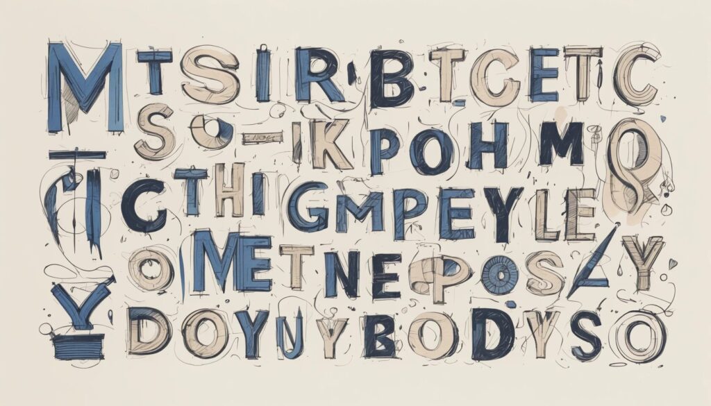
Best Website Fonts: The Top 20 for Web Design
- Serif, sans serif, and script fonts each convey wildly different emotions—choose accordingly.
- The top fonts for web design offer readability, personality, and versatility.
- Font pairing is an art: the right duos can turn a bland site into a design masterpiece (or a circus, if you’re not careful).
- Overly decorative fonts are best left to wedding invitations, not your body text.
Let’s be honest: picking the top fonts for web design is a bit like choosing the best ice cream flavor—everyone has opinions, most of them wrong. But some classics have stood the test of time. Roboto, Lato, and Poppins are so ubiquitous you’re probably staring at them right now. These fonts aren’t just safe; they’re beloved for their clean lines and all-purpose charm. Meanwhile, serifs like Georgia and Palatino give your site a touch of old-school gravitas—perfect if you want to look like you have a library and not just a Pinterest board.
But let’s not forget the rebels: display fonts like Abolition or whimsical choices like Eleven Twenty. They scream for attention, which is exactly why you shouldn’t use them for every single word on your site. Remember, the goal is not to make your visitors feel like they’ve been punched in the retinas.
Typography Tips for Web Design: How to Choose Website Fonts
- Align your font choices with your brand’s voice and message.
- Prioritize readability over trendiness—there’s a reason nobody uses Papyrus outside of “Avatar.”
- Use font pairing to create hierarchy and visual interest, not visual chaos.
- Consider performance: too many custom fonts and your site will load slower than dial-up.
- Accessibility isn’t optional—choose fonts that everyone can read, not just eagle-eyed designers.
Font selection isn’t just about pretty letters; it’s about brand psychology. If your site is about high-end watches and you slap on a playful handwriting font, congratulations, you’ve invented a new genre: luxury kindergarten. Your fonts must echo your message: bold and modern for tech, classic and serifed for tradition, minimalist for—well, minimalists. And, please, do not use more than three fonts on your site unless your secret goal is to make everyone dizzy.
The best website fonts are legible at all sizes and weights. Sure, that curlicue script looks adorable in your logo, but try reading a whole paragraph in it. It’s like deciphering ancient runes with a hangover. For body text, stick with humanist sans serifs or well-balanced serifs; for titles, you can get a little wild, but not “circus-poster-in-Comic-Sans” wild.
When it comes to website font pairing, think of fonts as dinner guests: you want harmony, not a food fight. Pair a strong headline font with a subdued body font. For example, a geometric sans serif like Poppins for headlines, balanced by a friendly workhorse like Open Sans for body copy. Don’t mix two divas—nobody likes a stage fight.
Website performance is another casualty of font overload. Every custom font is another file for your site to load, so unless you want your bounce rate to set records, choose wisely. And accessibility? It’s not just a buzzword. Fonts with clear letterforms and generous spacing are your friends. If your “l” looks like an “I,” or your “rn” looks like an “m,” you’re just inviting confusion—probably not the brand impression you want.
How to Pair Fonts for Maximum Impact
- Primary, secondary, and accent fonts each have a job—don’t let them all run wild.
- Contrast is your friend: pair serif with sans serif, bold with light, but avoid pairing two lookalikes.
- Use font families for built-in harmony (and fewer headaches).
- Reserve accent fonts for calls-to-action, not epic poems.
Let’s break it down: your primary font is your digital handshake—used in headings, it sets the tone. Your secondary font is the workhorse, handling body text and descriptions. Your accent font is the sprinter, reserved for buttons and calls-to-action where you need to shout (politely).
The secret sauce? Contrast. Pair a stately serif like Forum with a crisp sans serif like Lato. Or, if you’re feeling particularly daring, try a geometric sans for headlines and a humanist sans for paragraphs. Just don’t use two fonts that could be twins—nobody wants a family reunion on their homepage.
And for the love of all things legible, keep your accent font restrained. Yes, that neon pink cursive is eye-catching, but use it for your newsletter signup button, not your entire “About Us” page. Unless, of course, you want your site to be the graphic equivalent of a sugar rush.
The 20 Top Fonts for Web Design: A (Very Opinionated) List
- Roboto: Clean, efficient, and impossible to offend—like the Switzerland of fonts.
- Lato: Warm, friendly, and so easy to read, your grandma and your hipster cousin will both approve.
- Poppins: Modern, geometric, and so circular it could roll right off your screen.
- Open Sans: Neutral, flexible, and beloved by minimalists everywhere.
- Montserrat: All-caps headlines that actually look good? Yes, please.
- Georgia: The internet’s most polite serif—formal but never stuffy.
- Palatino: Old-school credibility with a contemporary twist.
- Forum: Roman-inspired, surprisingly current, and the font equivalent of a little black dress.
- Abolition: Punchy, all-caps, and perfect for headlines with something to prove.
- Graphik: Versatile, slightly hipster, and ready for your next portfolio site.
- Barlow: Inspired by highway signs—a road trip for your readers’ eyes.
- FS Me: Accessibility first, with extra legibility for everyone (not just the cool kids).
- Magnific Caos: Drama in every curve—use sparingly, unless your site is about heavy metal.
- Diastema: Playful ligatures and a dash of class.
- Caponi: Multiple personalities in one family—Display, Slab, and Text.
- Caudex: Medieval chic that somehow feels modern.
- Eleven Twenty: Futuristic, retro, and perfect for sci-fi blogs (or time travelers).
- FS Ostro: Elegance, legibility, and a pink background if you’re feeling wild.
- Ratio Modern: Thin meets thick for a look that’s all about contrast.
- Lil Grotesk: Not as scary as it sounds—rounded, friendly, and easy on the eyes.
Pick your favorites, but resist the urge to use them all at once. This isn’t a font buffet.
How to Avoid Font Fails: The Unforgivable Sins of Typography
- Don’t use more than three different fonts. Ever. Not even if you’re feeling spicy.
- Skip decorative fonts for body text—unless you want your bounce rate to break the sound barrier.
- Never pair two fonts from the same family unless you want your site to look like it fell asleep in design school.
- Avoid fonts that mimic handwriting for anything but the shortest, most charming headlines.
- Don’t shrink your font below 16px unless you’re targeting ants as your primary demographic.
If you’ve ever landed on a site where every paragraph is a different font, you know the feeling: chaos, confusion, and an urgent desire to close the tab. Overly decorative fonts, tiny text, and mismatched pairings are the enemy. There’s a special place in design purgatory for sites that combine Papyrus and Comic Sans—don’t be that person.
And no, using a script font for your blog post about tax law doesn’t make your content more exciting. It just makes your visitors wonder if you’ve lost your mind (or your eyesight).
Website Font Pairing: Real-World Examples That Actually Work
- Classic combo: Montserrat for headings, Open Sans for body text.
- Modern touch: Poppins headlines with Lato paragraphs.
- Serif sophistication: Georgia titles with Arial body copy for maximum readability.
- Minimalist dream: Roboto everywhere, in different weights and sizes.
- Experimental flair: Forum headers with Barlow for the main content.
Some font pairings are like peanut butter and jelly—unexpectedly perfect. Montserrat and Open Sans are the template for modern, readable design. If you want to get a little bolder, combine Poppins for big, round headlines and Lato for friendly, approachable text. For those who want to look like they just stepped out of a design magazine, Georgia paired with Arial is a classic. And if you’re a true minimalist, just use Roboto in varying weights—no one will accuse you of being too flashy.
Want to experiment? Take a look at Google Fonts for endless inspiration. But whatever you do, remember: less is (almost always) more.
Making Your Fonts Work for You: Practical Tips and Final Thoughts
- Keep titles between 30-70px, subtitles at 22-30px, and paragraphs at 16-20px for optimal readability.
- Bold, italic, and underline are accents, not crutches. Don’t go overboard.
- Test your site’s fonts on multiple devices and screen sizes—you might be surprised.
- Always set a fallback font in your CSS, just in case your main font goes on strike.
- Stay consistent—your font choices are part of your brand’s DNA.
It’s not just about choosing the best website fonts; it’s about using them like a pro. Size matters: giant headlines can look great, but if you go too big, your visitors will feel like they’re reading a ransom note. Subtitles should stand out, but not scream. And for body text, never stray below 16px. (Unless, of course, your target audience is hawks.)
Moderation is the secret ingredient in the recipe for font success. Use bold and italic for emphasis, but don’t turn every sentence into a typographic rollercoaster. Always preview your typography on phones, tablets, and desktops—because nothing says “I don’t care” like a site that’s unreadable on mobile.
Finally, your site’s font choices should be as consistent as your brand voice. If your homepage is all cool modern sans serifs and your contact page suddenly bursts into medieval script, your visitors may think they’ve wandered into a Renaissance fair by accident.
The Final Word: Why Fonts Matter More Than You Think
Fonts are silent salespeople, working 24/7 to shape your brand’s identity, influence trust, and guide your visitors’ emotions—before you even say “hello.” The best website fonts don’t just look good; they communicate, persuade, and sometimes even seduce. So be bold. Be selective. Ignore the siren call of novelty fonts, and instead, choose typefaces that make your brand sing (not scream).
Ready to transform your website from forgettable to unforgettable? Pick your fonts wisely, pair them artfully, and remember: when in doubt, keep it simple, keep it readable, and keep Comic Sans where it belongs—deep in the abyss of your childhood word processor. Your audience (and their eyeballs) will thank you.