Did you know it takes just 90 seconds for visitors to form an opinion about your website, and up to 90% of that judgment is based on color alone? If that statistic doesn’t make you want to throw your existing website color schemes out the digital window, nothing will. The psychological impact of color in web design is so enormous, it’s a wonder we aren’t all consulting with a panel of color therapists before launching our next site. Yes, your website color palette could be the difference between a visitor falling in love with your brand—or running for the hills, clutching their retinas. From the strategic use of hues to the subtle art of contrast, let’s unravel the dazzling (and sometimes dizzying) world of professional website color palettes. Whether you’re lost in a Canva website design or just trying to understand what website color psychology even means, prepare for a slightly irreverent journey where colors aren’t just pretty—they’re powerful, persuasive, and occasionally, just a little bit dramatic.
Why Website Color Schemes Are Non-Negotiable
- Color influences first impressions and brand trust, often before a single word is read.
- Strategic palettes can boost engagement, conversion, and recall—while bad ones can repel visitors faster than a pop-up ad from 2002.
- Website color psychology taps into emotion and decision-making, subtly steering user behavior.
Let’s not pretend: people are shallow when it comes to websites. The right website color schemes are like the little black dress of the digital world—timeless, powerful, and, if you get it wrong, absolutely unforgiving. Visitors make snap judgments, often without even realizing it. A trustworthy blue? Suddenly, your site feels like a safe haven. An angry red everywhere? Congratulations, you’ve created a digital alarm bell.
But it’s not just about making things “look nice.” Strategic use of color can encourage users to click that magical “Buy Now” button, subscribe to your newsletter, or maybe—just maybe—stick around long enough to actually read what you have to say. Ignoring website color psychology is akin to driving with your eyes closed: risky, pointless, and likely to end in disaster.
Professional website color palettes don’t just appear out of thin air (unless you’re a design wizard). They’re carefully crafted to evoke trust, energy, calmness, or whatever fits your brand’s soap opera of emotions. Ignore this, and your website might as well be a digital haunted house—visitors come in, scream, and never return.
How to Choose a Website Color Palette That Won’t Scare Away Your Audience
- Start by understanding your brand’s personality and what emotions you want to trigger in visitors.
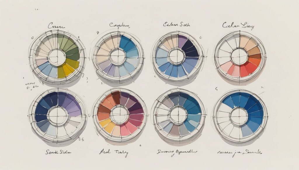
- Use tools like the Canva color wheel to find harmonious combinations (no, guessing from your favorite sweater’s pattern does not count).
- Consider your audience’s demographics—because neon green might be a hit with teenagers, but probably not with luxury real estate buyers.
- Test your palette in real designs before unleashing it upon the world; what sparkles in theory may fizzle in practice.
Choosing a website color palette is not the time to embrace your inner rebel without a cause. It’s a balancing act between brand identity and audience expectations. Want to radiate sophistication? Ditch the rainbow and lean into deep blues, grays, or muted jewel tones. Dreaming of fun and energy? Go bold—but please, not “clown car” bold.
Thankfully, you don’t have to rely on divine inspiration or a dartboard. Tools like Canva’s color wheel are designed to keep you from making tragic chromatic mistakes. They’ll help you pair colors that won’t fight each other for attention or, worse, team up to assault your visitors’ senses. And remember: what works for a fintech startup will make a cupcake bakery look like a frozen bank vault. Know your audience, or prepare for a digital ghost town.
Finally, always test your color choices with actual layouts. That trendy shade of millennial pink might look delightful on a swatch, but in a block of text? Suddenly, it’s less “Instagram chic” and more “eye exam.”
Website Color Psychology: The Secret Sauce of Conversion (and Emotional Manipulation)
- Colors evoke psychological responses—blue for trust, red for urgency, green for growth or “buy now!”
- Color can subtly guide users toward actions, like clicking a button or filling out a form.
- Ignoring psychology in color choices is like ignoring gravity—prepare for a crash landing.
Let’s call it what it is: website color psychology is emotional manipulation in its Sunday best. Blue makes people feel safe (just ask Facebook), red gets the adrenaline pumping (“Buy now or regret forever!”), and green gently whispers, “Everything is fine. Go ahead, give us your credit card.”
Brands worldwide exploit these triggers with all the subtlety of a magician pulling a rabbit out of a hat. If you want visitors to perceive your site as secure, calm, and reliable, slap on some blue. Want to trigger action? Red is your friend, but use it sparingly—unless you want your website to resemble a fire alarm.
Ignoring the psychological effects of color is like ignoring the weather forecast before planning an outdoor wedding. Sure, you could get lucky… but don’t count on it. Invest some time in understanding how different colors affect emotion and behavior, and your website might just become a conversion powerhouse instead of a digital tumbleweed farm.
Designer-Approved Website Color Schemes: Why Copying the Pros Isn’t Just Smart—It’s Essential
- Top brands use proven color schemes to reinforce their identity and influence perception.
- Studying successful palettes (from Facebook’s blues to eBay’s rainbow) helps avoid rookie mistakes.
- Using Canva website design templates can instantly upgrade your color game without a PhD in color theory.
If you think you’re too creative to learn from the best, think again. There’s a reason Facebook bathes itself in blue, and it’s not just because Mark Zuckerberg likes the color. It’s about trust, brand recall, and the psychological comfort of a familiar hue. Likewise, eBay doesn’t just toss every color in the crayon box onto their homepage for fun. It’s a deliberate strategy to convey energy, diversity, and a hint of excitement (or chaos, depending on how much you love online auctions).
There’s no shame in borrowing from the pros. In fact, it’s practically a rite of passage. Studying successful palettes gives you a fast track to what works—and what absolutely does not. If you’re short on time (or patience), Canva website design templates come pre-loaded with professional website color palettes that have already passed the “human eyeball test.” Copy away, and watch your site transform from drab to fab—no color therapy required.
Common Color Catastrophes—and How to Avoid Them
- Too many colors create chaos; too few create boredom—there is a (colorful) middle ground.
- Poor contrast can make content unreadable, which is great if you want visitors to squint and leave.
- Ignoring accessibility alienates users; inclusive color choices ensure everyone can enjoy your masterpiece.
Let’s be honest: most color disasters aren’t acts of nature—they’re self-inflicted. Overzealous designers sometimes treat their website like an all-you-can-eat color buffet. The result? A migraine-inducing mishmash that sends visitors running. On the flip side, monochrome monotony can make your site so dull that even robots lose interest.
Contrast is your friend—unless your idea of fun is hiding text in plain sight. Make sure buttons, links, and text are easily distinguishable from the background. If your site forces users to highlight text just to read it, you’re doing the digital equivalent of serving soup with a fork.
Last but never least: accessibility. Colorblind users exist, and they’d appreciate not feeling excluded. Use tools to check your color palette for accessibility, ensuring your website’s beauty isn’t reserved for the genetically gifted. After all, a truly professional website color palette is one that everyone can enjoy—no decoder ring required.
Tips for Crafting a Professional Website Color Palette (Without Losing Your Mind)
- Limit your core palette to 3–5 colors for cohesion and flexibility.
- Establish hierarchy: primary, secondary, and accent colors should each have a role.
- Document your palette (with hex codes!) in a brand kit for easy, consistent use.
- Don’t be afraid to iterate—your first attempt probably isn’t your Mona Lisa.
Let’s face it: more isn’t always merrier, especially when it comes to color. Stick to 3–5 core colors—enough to create visual interest, but not so many that your site looks like a Jackson Pollock painting (unless that’s your brand, in which case, carry on). Assign roles: primary for backgrounds, secondary for navigation, and accent for those irresistible call-to-action buttons.
Write down those hex codes like they’re the combination to your safe. Stashing your palette in a brand kit is the only way to guarantee consistency across everything from your homepage to your error pages (because even your 404s deserve to look good).
And don’t be precious—iterate! Test, tweak, and test again. The first draft of your palette might look like an accident in a paint store. Keep refining until your colors sing in harmony, not scream for attention.
Leveraging Canva Website Design for Effortless Color Mastery
- Canva offers a treasure trove of pre-designed website color schemes and templates.
- Experiment with combinations using live previews—no guesswork, no regrets.
- Brand kits in Canva ensure your palette is always at your fingertips, ready for world domination (or at least, digital admiration).
If you’re not using Canva for your website color schemes, are you even trying? Canva’s website design tools are like having a designer on speed dial—except you don’t have to buy them coffee. Browse, pick, and customize professional website color palettes with a few clicks. No advanced degree in color theory required. Live previews mean you’ll see instantly whether your palette is a match made in heaven or a cautionary tale for future generations.
With brand kits, you can store your carefully crafted palette, ensuring you (and your team) don’t stray from the path of chromatic righteousness. Consistency is king in branding, and Canva helps you rule your domain with a neon (or muted) fist.
Conclusion
Let’s face it: nobody will remember your quirky headline or heartfelt mission statement if your color scheme is more confusing than a modern art exhibit. The right website color palette is the silent ambassador of your brand—working tirelessly behind the scenes to earn trust, inspire action, and maybe even spark a little joy. Whether you’re a bold innovator or a cautious minimalist, mastering website color psychology and leveraging tools like Canva website design is your shortcut to a site that dazzles (and converts). So put down the color wheel of doom and start building a palette that works as hard as you do. Your brand—and your visitors’ eyeballs—will thank you.