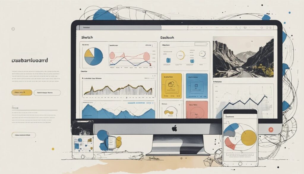
Let’s face it: Data is the new oil, and dashboards are the pipelines. But if you think a dashboard is just a fancy digital corkboard for stats and squiggly lines, think again. In the world of digital products, dashboard design best practices have become the holy grail for anyone who wants to transform chaos into clarity. From the mission-critical types of dashboards to the smallest dashboard components, nailing your design is not just about making things pretty—it’s about making users feel like data-wielding superheroes (or at least, less like confused mortals). So buckle up: we’re about to dive into the wild, occasionally absurd world of dashboard design, where data visualization in dashboards is both an art form and a survival skill, and where dashboard UI kits might just save you from design purgatory.
Understanding the Core of Dashboard Design
- Dashboards are not cluttered information dumps—they are curated overviews.
- Types of dashboards serve different user needs: operational, analytical, and strategic.
- Every dashboard should prioritize relevance, clarity, and speed of insight.
Let’s shatter a myth: more data does not mean better dashboards. True dashboard design is about ruthless curation. A well-made dashboard is a control center, not a hoarder’s attic for numbers. Think of it as the cockpit of a fighter jet—do you really want a gauge for every minor detail, or just the critical stuff that keeps you airborne? Different types of dashboards exist for a reason. Operational dashboards keep users updated in real time (think: “your site just crashed!”), analytical dashboards help spot trends (“why is my sales curve shaped like a sad trombone?”), and strategic dashboards track those big, hairy KPIs that make or break quarterly meetings. If your dashboard doesn’t make users feel smarter, faster, and more in control, congratulations: you’ve built a digital haystack and hidden all the needles.
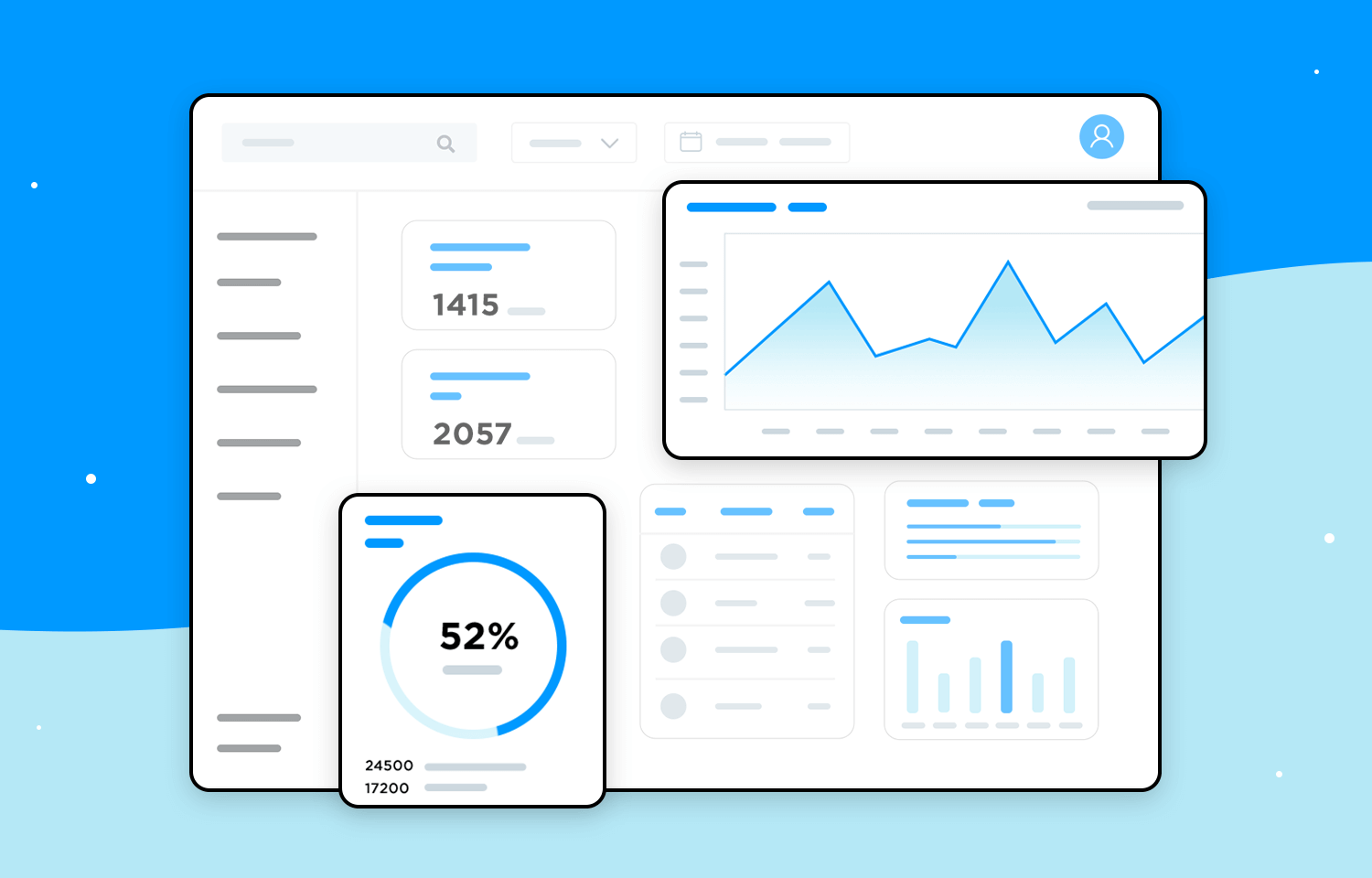
Key Dashboard Components: The Unsung Heroes
- Charts and graphs simplify complexity and spotlight trends.
- Tables provide the nitty-gritty for data-obsessed users.
- KPIs and metrics act as the headline news.
- Filters and controls hand over the steering wheel to users.
- Navigation keeps chaos at bay with logical structure.
Every dashboard is an ensemble performance. Charts and graphs are the rock stars—bold, visual, and occasionally prone to stealing the spotlight (we’re looking at you, pie chart). But don’t underestimate the supporting cast: tables may not be glamorous, but when users want raw, unfiltered data, they deliver. KPIs and metrics are the clickbait headlines of your dashboard, grabbing attention with big numbers and dramatic deltas. Then there are filters and controls, which let users slice and dice data until they’re satisfied, and navigation, which quietly prevents anyone from getting lost in an endless maze of widgets. Miss one of these components, and your dashboard risks becoming the Bermuda Triangle of user experience.
Dashboard Design Best Practices: Irony Meets Function
- Start with user needs, not designer ego.
- Keep it to one screen—no one wants to scroll forever.
- Embrace the F and Z reading patterns for optimal layout.
- Responsive design isn’t optional—it’s survival.
- Lead with bold, actionable data.
- Consistency in design language and color is your secret weapon.
Dashboard design best practices are not arbitrary rules—they’re the result of thousands of users silently cursing at confusing layouts and information overload. Rule number one: design for user needs, not your portfolio. If your dashboard is a labyrinth, your user will become the Minotaur. Stick to the essentials and keep everything on one screen; when in doubt, remember: infinite scrolling is the enemy of efficiency. Utilize the F and Z reading patterns—science says that’s how eyes scan a page, so why fight Mother Nature?
Responsive dashboards are the difference between a user feeling empowered and feeling like they’ve accidentally logged into the Matrix. Give them control—filters, toggles, sliders—so they can see what matters most. And for heaven’s sake, lead with the big, bold numbers! This isn’t the time for humility. Use color and typography to create a visual hierarchy; just don’t go full rainbow, unless your dashboard’s secret purpose is to induce headaches. Consistency is your friend—switching design languages mid-dashboard is like speaking Klingon in a Shakespeare play.
Mastering Dashboard Layout and Structure
- Grid systems keep your design from descending into chaos.
- Sections and panels break up complexity into digestible bites.
- Hierarchy ensures that the most important info grabs attention first.
Imagine a dashboard without structure. It’s like a pizza with all the toppings dumped in one corner—technically edible, but a culinary crime. Grid layouts are your invisible scaffolding, giving every component its rightful place and preventing visual anarchy. Use sections and panels to group related information like chapters in a gripping novel. Users shouldn’t need a treasure map to find the sales graph.
Hierarchy is your best friend here. Place the most crucial KPIs and insights in prime real estate: top left or center. As you descend the page, the information can become more detailed or specialized, like peeling back the layers of a particularly data-laden onion. If users have to search for what matters, you’ve failed at dashboard Tetris—go directly to design jail, do not pass Go.
Data Visualization in Dashboards: The Art of Making Data Behave
- Good visuals turn data into instant insights.
- Patterns and anomalies leap out, saving brainpower.
- Design choices—colors, chart types, layouts—make or break comprehension.
- Engagement increases when data looks as good as it is useful.
Data visualization in dashboards is not just decoration; it’s the translation layer between raw data and human understanding. Replace dense tables with charts that let trends jump off the page. Want to see a sudden sales spike? Bar charts have your back. Need to track a sneaky downward trend? Line graphs are your early-warning system. Pie charts? Use sparingly—they’re the glitter of data viz: fun, but easily overdone.
The right visual choices help users spot patterns and outliers without needing a PhD in statistics. Your color palette, chart types, and visual hierarchy should all work together in harmony—think jazz band, not middle school recorder recital. And yes, good design is engaging. A dashboard that looks sharp keeps users coming back, while an ugly one is quietly ignored until the next redesign budget comes through.
Inspiring Dashboard Examples: What Great Looks Like
- Variety is the spice of dashboards: sales, finance, health, and more.
- Well-designed dashboards offer instant comprehension.
- Modern UI kits accelerate the path from idea to execution.
- Customization and interactivity are no longer optional niceties.
Need proof that dashboards can be more than glorified spreadsheets? Feast your eyes on a smorgasbord of dashboard examples—from e-learning hubs that track your procrastination habits, to analytics dashboards that promise to make sense of your business’s rollercoaster metrics. The best examples combine clean layouts, powerful visualizations, and intuitive controls, creating a user experience that’s both informative and, dare we say, kind of fun.
Want to skip the pain of reinventing the wheel? Modern UI kits, offer customizable templates and components that let you focus on the data, not the drudgery. Whether you’re building a fitness tracker, a smart home hub, or a project management behemoth, there’s a dashboard example out there that can jumpstart your design. And let’s not forget: users now expect interactivity and personalization. If your dashboard feels like a relic from the era of dial-up modems, it’s time to level up.
Design Faster and Smarter with Dashboard UI Kits
- Pre-built UI kits save you time and prevent design disasters.
- Comprehensive libraries cover charts, tables, and navigation elements.
- Tailor dashboards for industries like finance, HR, and sales with specialized kits.
- Wireframing and prototyping let you test before you commit.
Why start from scratch when you could stand on the shoulders of design giants? Dashboard UI kits are the cheat code for creating dashboards that look polished and work intuitively. With pre-built charts, interactive components, and design systems tailored to platforms like Salesforce, SAP Fiori, and Oracle Alta UI, you can skip the endless pixel-pushing and focus on actual user value.
UI kits aren’t just about speed—they’re about sanity. They impose consistency, reduce errors, and help ensure your dashboard doesn’t end up looking like a ransom note. Plus, wireframing and prototyping mean you can test layouts and flows with real users (or at least your most opinionated colleagues) before your dashboard ever sees the light of production. The result? A dashboard that feels professional, not accidental.
The Future of Dashboard Design: Trends and Takeaways
- Personalization and interactivity are becoming the rule, not the exception.
- Mobile-first and responsive designs are essential, not afterthoughts.
- Data storytelling will separate the memorable dashboards from the forgettable.
- Design systems and UI kits will continue to accelerate quality and innovation.
If you thought dashboards were just a passing trend, think again. The future belongs to interfaces that adapt, personalize, and anticipate user needs. Dashboards should feel like a helpful co-pilot, not a backseat driver barking irrelevant metrics. Your design should work seamlessly on any device—try explaining to a VP why their KPI dashboard looks like a Picasso painting on mobile.
As data storytelling becomes a must-have skill, dashboards will evolve from static screens to dynamic narratives, guiding users through insights with the finesse of a Netflix documentary (and hopefully, fewer cliffhangers). With design systems and UI kits leading the way, the next generation of dashboards will be smarter, faster, and—dare we dream—maybe even delightful to use.
Conclusion
Great dashboard design isn’t about shoving every data point onto one screen or dazzling users with gratuitous gradients. It’s about clarity, relevance, and empowering users to make decisions without breaking a sweat (or breaking their keyboard in frustration). By focusing on proven dashboard design best practices—curated components, thoughtful layouts, engaging data visualization, and intuitive interactivity—you’ll build dashboards that users actually love. Don’t settle for digital clutter. With the right approach and dashboard UI kits, your next dashboard won’t just be functional—it’ll be unforgettable. Go forth, and design dashboards that make data sing (and users do a happy dance).