Did you know that 61% of users will abandon a website faster than you can say “404 error” if they can’t find what they’re looking for in seconds? That’s right — your website layout isn’t just about making things look pretty; it’s a brutal battlefield where only the best website page layouts survive. Whether you’re a bold entrepreneur plotting your online empire or a designer with a penchant for pixel-perfect grids, your website’s layout is the silent salesperson that either invites people in for a digital cappuccino or shoves them out the door and into the arms of your competitors. Let’s cut through the chaos and uncover why the right website layout design ideas aren’t optional — they’re everything. Expect homepage layout examples, landing page design tips, and a few doses of playful exaggeration as we untangle the world of responsive website layouts (spoiler: not all layouts are created equal, and yes, some are truly tragic).
Why Website Layouts Matter More Than Your Logo (Sorry, Designers)
- Website layout is the backbone of user experience and conversion.
- Cluttered, confusing, or outdated layouts drive visitors away instantly.
- Responsive website layouts are now a baseline expectation, not a bonus feature.
- Strategic placement of elements guides users toward actions that matter.
Let’s be honest: you could have a logo designed by Michelangelo himself, but if your website’s navigation feels like a corn maze, nobody’s sticking around to admire your masterpiece. The best website page layouts are deliberately constructed to make user journeys effortless, guiding eyes to the juiciest bits — your offers, your story, your glorious “Buy Now” button. And if you think people will pinch and zoom their way through your non-responsive relic, think again. In 2025, users expect responsive website layouts as much as they expect doors on restaurants. Ignore at your peril.
Clutter is the enemy of clarity. Overcrowd your homepage and watch your bounce rate soar — 94% of users say easy navigation is the most important website feature. If your layout is a digital hoarder’s paradise, even the most determined visitors will run for the hills (or, you know, Google). Smart layouts use hierarchy, negative space, and clear calls to action, making the user’s path smoother than a freshly Zamboni’d ice rink.
And let’s not forget conversion. The placement of a button or a form can be the difference between a new customer and another statistic in your analytics dashboard. Great layouts gently herd users toward action, making the decision to click feel like their idea all along. That’s not just good design — that’s psychological wizardry.
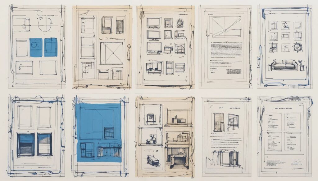
Homepage Layout Examples That Deserve a Standing Ovation
- Full-screen hero images grab attention instantly and set the mood.
- Card-based layouts organize information, perfect for visual-heavy brands.
- Masonry and grid-breaking designs create visual intrigue and break monotony.
- Three-column and circle-based layouts offer structure and a touch of whimsy.
The homepage is your digital red carpet — and you don’t want guests tripping over it. Enter the full-screen hero image: a bold, cinematic statement that screams, “Look at me!” Use this if you have visuals worth flaunting — think food, travel, or products that don’t resemble beige cubes. If your business is about spreadsheets or cloud software, maybe keep the hero image to a tasteful minimum, unless your software is so beautiful it makes grown developers weep (Apple, we’re looking at you).
For the organizationally obsessed, card-based layouts bring order to chaos by chunking content into neat, clickable boxes. They’re ideal for e-commerce, blogs, or portfolios — if you want users to browse, cards are your friend. Masonry layouts take this up a notch, mixing card sizes for a “curated gallery” vibe. It’s like a card party where everyone’s a different height, but somehow it works.
Feeling rebellious? Try a grid-breaking layout: overlapping elements, unexpected alignments, and a dash of asymmetry. It’s edgy, modern, and sure to make traditionalists clutch their pearls. Just don’t break the grid so badly your content looks like a ransom note.
If you’re Goldilocks about structure, three-column layouts offer balance. Place your star products or services in each column and bask in the harmonious glory. For brands that think outside the (rectangular) box, circle-based layouts are rare but memorable — perfect for making visitors pause and think, “Well, that’s different.” Use with caution, or risk looking like you’re stuck in a 2014 design trend time capsule.
Landing Page Design Tips: Conversion, Not Confusion
- Simplicity reigns with one-column landing pages for focused CTAs.
- Two-column layouts balance information and forms for higher engagement.
- Asymmetrical and Z-pattern layouts guide the eye and boost interaction.
- Coming soon pages can build anticipation — or just annoy everyone.
Landing pages are the digital equivalent of a handshake — and nobody likes a handshake that lasts too long or is covered in glitter. The one-column layout is the undisputed champion of clarity: headline, offer, call to action, done. No distractions, no detours, no “Where’s Waldo?” games to find the sign-up form. It’s so simple, it’s almost rude — and that’s exactly what you want when conversions are on the line.
But what if you want to showcase a bit more, like testimonials or product features? Two-column landing pages let you strut your stuff without overwhelming the visitor. Place the pitch on one side and the form or CTA on the other. On desktop, it’s a beautiful balance. On mobile, it collapses gracefully — or at least it should, unless you enjoy torturing your audience with horizontal scrolling.
For the adventurous, asymmetrical layouts and Z-pattern designs add energy to the page, subtly nudging users’ eyes in the direction you want. If you’re tired of the “block, block, button” formula, these layouts mix things up without sacrificing usability. Just remember: if the path to your CTA starts to resemble a treasure map, you’ve gone too far.
As for coming soon pages, they can spark curiosity or cause collective eye-rolls. If you’re going this route, keep it snappy: a bold headline, a hint of what’s to come, and a form for the truly obsessed. Don’t make users jump through hoops for vague promises — unless you’re running a secret society, in which case, carry on.
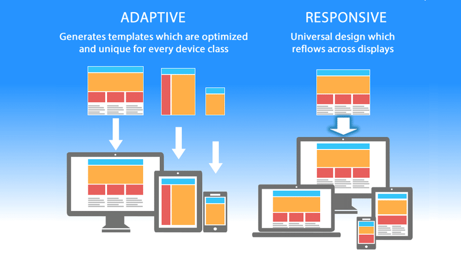
Responsive Website Layouts: Because the World Doesn’t Browse on a Potato
- Mobile-first design is essential, not optional, in today’s landscape.
- Flexible grids and scalable images keep layouts looking sharp on any screen.
- Test across devices to avoid embarrassing formatting fails.
- Navigation and CTAs must remain accessible and obvious everywhere.
Let’s state the obvious: if your website looks fab on a 32-inch monitor but transforms into a digital Jenga puzzle on a smartphone, you’re hemorrhaging users. Responsive website layouts adapt gracefully to every device, from phones to tablets to those fridge screens that, for some reason, can browse the internet. It’s 2025 — if your site can’t keep up, it’s basically a digital fossil.
Responsive design starts with flexible grids and scalable images. No more fixed-width layouts that scream “built in 2010.” Your content should rearrange itself like a well-trained marching band, not a pile of laundry. This isn’t just about aesthetics; it’s about usability. If buttons are too close together or navigation disappears behind a mysterious hamburger icon, don’t expect users to stick around and decipher your design riddles.
Testing is non-negotiable. Open your site on every device you can find: phone, tablet, grandma’s old iPad. What looks sleek on one screen might look like a design crime on another. Navigation and CTAs should always be front and center — or else you’re just inviting users to play hide and seek (spoiler: they’ll give up).
The best website page layouts are responsive by default, not as an afterthought. Anything less and you might as well post your content on a billboard and hope for the best.
How to Choose the Best Website Layout Design Ideas for You (And Not Your Ego)
- Start with your audience’s needs, not your personal design preferences.
- Map user journeys to prioritize key actions and information flow.
- Consider your content: visual-heavy brands need different layouts than text-focused ones.
- Test, iterate, and resist the urge to reinvent the wheel for the sake of “being different.”
Choosing a website layout isn’t a personality test — it’s a strategic decision. Don’t let your inner artist take the wheel and drive off a usability cliff. Begin by understanding who your users are and what they need. If your visitors are here for quick answers, don’t bury information under layers of avant-garde design.
User journey mapping is your secret weapon. Identify the main actions you want people to take, and make those actions as obvious as a neon sign at midnight. Use visual hierarchy to direct attention and avoid the dreaded “wall of text” effect. Your layout should serve your content, not the other way around.
Visual businesses — think photography, food, fashion — benefit from image-forward layouts like full-screen heroes or masonry grids. If words are your bread and butter, text-centric, single-column layouts are your friend. Don’t force a visual layout onto a blog about tax codes. That’s just cruel.
Finally, test with real users. Your layout isn’t a static monument; it’s a living thing that should evolve as you learn what works. If all else fails, remember: the goal isn’t to win design awards; it’s to have users stick around long enough to remember your name (and maybe, just maybe, click “Buy”).
Summary: Your Website Layout Can Make or Break You (No Pressure)
Let’s recap the not-so-shocking truth: website layout design ideas are the unsung heroes of digital success, turning casual clicks into raving fans — or, with a single misstep, into ghosts in your analytics. The best website page layouts blend clarity, creativity, and conversion power, whether you’re showcasing a dazzling portfolio, launching a must-have product, or just trying to get someone to read past the first sentence. Responsive website layouts are essential, not optional, and the homepage layout examples and landing page design tips above are your cheat sheet to standing out (for the right reasons). So, put these tips to work, test ruthlessly, and don’t be afraid to break the mold — as long as you know why you’re breaking it. Your users demand brilliance. Are you ready to deliver?