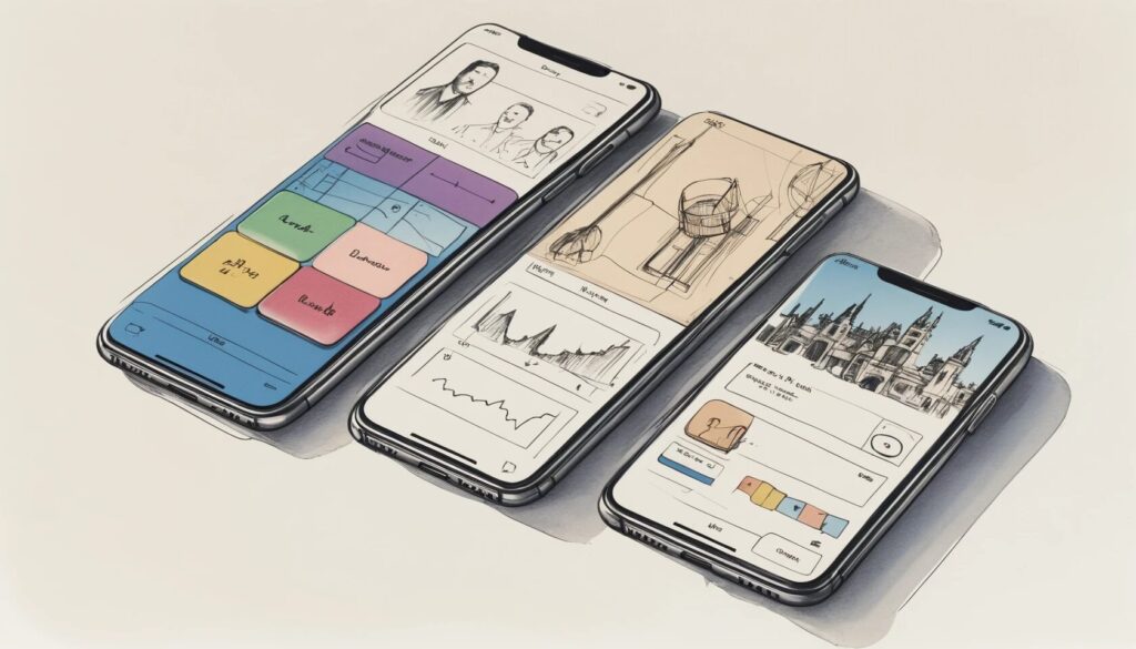
“Good design is obvious. Great design is transparent.” Or so the saying goes. But let’s face it: most digital products are about as transparent as a brick wall covered in neon Comic Sans. When you ignore core UI design principles, you’re not just making your product unattractive—you’re basically inviting users to rage-quit and never return. With the rise of tools like the Figma design tool, the bar for exceptional user experiences is so high that tripping over it is practically a rite of passage for aspiring designers.
If you’re determined to create user interfaces that don’t send people running for the hills (or worse, your competitor’s app), it’s time to master the art—and science—of UI design. Let’s unpack the seven essential principles that separate delightful products from digital disasters, while giving a nod to hierarchy, progressive disclosure in UI, accessible UI design, and other tricks of the trade. Prepare for a whirlwind tour—with just a dash of irony and a sprinkle of exaggeration—through the non-negotiable rules of modern interface design.
Why UI Design Principles Matter (More Than Your Favorite Color Palette)
- UI design principles are the backbone of intuitive, user-friendly products.
- Intelligent UI reduces user frustration and increases engagement.
- Ignoring these principles leads to cognitive chaos and user drop-off.
- Consistency and clarity save time for users and designers alike.
Let’s be honest: nobody wakes up thinking, “Today, I want to be confused by an app.” Yet, far too many digital products are designed with the reckless abandon of a toddler with a box of crayons. UI design principles are not just guidelines—they’re survival tools in the wild jungle of digital interfaces. They help users navigate, find what they need, and (astonishingly!) enjoy the experience. When you adhere to these principles, you create a sense of predictability and ease, making even the most complex apps feel like a stroll through a well-manicured park rather than a maze in a horror movie.
The Figma resource library is overflowing with evidence: teams that respect consistency, clarity, and accessibility are rewarded with higher engagement, faster task completion, and a lot fewer angry emails. Or, you could ignore UI design principles and watch your users vanish faster than free donuts in an office break room. Your call.
The Seven Commandments of UI Design: Principles You Ignore at Your Own Risk
- Hierarchy: Guide users to what matters most with deliberate visual arrangement.
- Progressive Disclosure: Reveal information as needed, not all at once.
- Consistency: Keep patterns and interactions uniform across the interface.
- Contrast: Use visual differences to direct attention and clarify actions.
- Accessibility: Design so everyone—yes, everyone—can use your product.
- Proximity: Group related items together to create logical relationships.
- Alignment: Ensure everything lines up for a polished, professional look.
Let’s break down these unimpeachable laws of UI design principles, one dramatic exaggeration at a time:
Hierarchy is your secret weapon against visual anarchy. By manipulating size, color, and arrangement, you’re not just decorating—you’re telling users, “Hey, look here first, then there, then maybe, just maybe, over there.” A well-constructed user interface hierarchy lets users find the “buy now” button instead of the “self-destruct” option (which, let’s face it, should always be hidden).
Progressive disclosure in UI is the digital equivalent of not dumping the entire encyclopedia on someone’s head at once. Instead, you reveal just enough to keep them interested—like a Netflix series that ends every episode on a cliffhanger. Overwhelm users, and they’ll bail faster than you can say “onboarding fail.”
Consistency is the golden rule. If your buttons start shape-shifting or your navigation menu moonlights as a pop quiz, you’re not clever—you’re confusing. Uniformity in design patterns isn’t boring; it’s the difference between a smooth ride and a rollercoaster with missing tracks.
Contrast separates the important from the irrelevant. Want users to notice a call-to-action? Make it pop. Want them to ignore legal disclaimers? (Kidding! Sort of.) Without contrast, your interface is a beige wasteland where nothing stands out, and users are left to wander, lost and alone.
Accessible UI design isn’t just a box to check; it’s a moral and practical obligation. If your app is a fortress that only the perfectly abled can enter, you’re doing it wrong. Embrace WCAG standards, use proper contrast, and support keyboard navigation—unless your secret goal is to alienate 25% of the world’s population.
Proximity is about grouping related items. Put the ketchup next to the fries, not the dessert. Buttons that belong together should look like they’re best friends, not distant acquaintances who only text on birthdays.
Alignment is the invisible glue that keeps your interface from looking like it was designed by a committee of cats. Grid systems are your friend. Use them, and your designs will exude confidence and order. Ignore them, and your app will look like a ransom note.
How the Figma Design Tool Supercharges UI Principles
- Figma streamlines design with real-time collaboration and shared libraries.
- Design systems in Figma enforce consistency and hierarchy.
- Plugins and accessibility features help designers get contrast and inclusivity right.
- Prototyping and testing are integrated for rapid iteration.
If you’re still shuffling between a dozen disconnected tools to cobble together an interface, it’s time to discover the magic of the Figma design tool. Figma is the superhero cape you never knew you needed. Its collaborative features mean you can watch in real time as your teammate “helpfully” moves your carefully aligned button 3px to the left. Jokes aside, Figma’s shared styles and design libraries are the ultimate enforcers of UI consistency; they let teams build, document, and deploy design systems that keep errant colors and rogue fonts at bay.
With plugins for accessibility checks and contrast validation, even the most color-blind designer can ensure their interface is readable for all. Prototyping flows inside Figma lets you test progressive disclosure strategies (or, you know, just hide all the settings behind a single button labeled “Good Luck”). And because feedback and iteration happen in one place, you can fix alignment issues before they become legendary Slack memes. In short: Figma doesn’t just make designing faster—it helps you enforce every single UI design principle with ruthless efficiency. You’re welcome.
Hierarchy: The Art of Showing Off (But Just the Right Things)
- Hierarchy directs attention to priority elements using size, color, and placement.
- Strong hierarchy reduces user confusion and speeds up decision-making.
- Figma’s grid and frame tools simplify the creation of effective hierarchy.
Let’s not pretend: everyone wants their “Sign Up” button to be the Beyoncé of the interface—front and center, impossible to miss. That’s what user interface hierarchy is all about. By manipulating the visual weight of elements, you can guide users to what truly matters (and, let’s be real, away from that “delete account” option).
Hierarchy isn’t just about making things big and bold. It’s about intelligent arrangement: the right headline, the right button, the right call to action—presented in the right order. A well-structured hierarchy means users don’t have to play “Where’s Waldo?” every time they open your app. Tools like Figma’s auto-layout and grid systems make it almost impossible to mess up—unless you’re actively trying to create chaos, in which case, congratulations on your avant-garde art project.
Progressive Disclosure in UI: Less Is More, Until It Isn’t
- Progressive disclosure minimizes user overwhelm by revealing complexity gradually.
- It supports smoother onboarding and task flows.
- Clear navigation cues prevent users from getting lost during multi-step processes.
If you want to see a human shut down, show them a screen jammed with every feature, setting, and preference your product offers. Progressive disclosure in UI is the noble art of not dumping everything on your users at once. Instead, you reveal features and information in digestible chunks—just enough to keep them moving forward, not enough to make them run screaming.
This principle is especially important during onboarding. If you’ve ever abandoned a sign-up because it asked for your pet’s maiden name and the square root of your favorite color, you know why progressive disclosure matters. Figma’s prototyping lets you test these flows before unleashing them on unsuspecting users, ensuring you’re unveiling just the right amount at every step.
Accessible UI Design: Because Exclusion is So Last Century
- Accessible UI design caters to users with diverse abilities and needs.
- Contrast, alt text, and keyboard navigation are critical for inclusivity.
- Legal compliance is important, but empathy is non-negotiable.
Designing for everyone isn’t just a nice sentiment—it’s a ruthless competitive advantage. Accessible UI design means your app works for people who use screen readers, keyboard navigation, or just have a different way of interacting with technology. It’s not about ticking a box; it’s about making sure your product isn’t a members-only club for the tech elite.
Contrast is a big deal—if your interface looks like a Monet painting to anyone with color blindness, it’s time to rethink your color palette. Alt text for images, logical tab orders, and consistent interaction patterns are the unsung heroes of inclusive design. Figma’s accessibility plugins and built-in contrast checkers make it easier than ever to build products that welcome everyone, not just the lucky few. Because, let’s face it, the only thing worse than losing users is actively shutting them out.
The Subtle Genius of Proximity and Alignment
- Proximity groups related items for faster comprehension.
- Alignment creates visual harmony and makes interfaces look intentional.
- Disorganized layouts erode user trust—fast.
Imagine walking into a grocery store where ketchup is stocked next to shampoo. That’s what bad proximity feels like in UI: users can’t tell what goes with what, and they’re left wandering the digital aisles in confusion. Group related items together and users will thank you (or at least, won’t curse your name in app reviews).
Alignment, meanwhile, is the secret ingredient to looking like you know what you’re doing. A well-aligned interface whispers, “This product is trustworthy and professional.” A misaligned one shouts, “I made this in five minutes between meetings.” Figma’s snapping features and alignment tools practically beg you to keep things neat—ignore them at your own peril (and prepare for mockery in design critiques).
Pro Tips for Applying UI Principles Like a Pro (Or at Least, Faking It)
- Guide users with clear flows and logical step sequences.
- Keep navigation and interactions as effortless as possible.
- Use keyboard shortcuts and quick-access tools to boost productivity.
- Test early and often to catch hidden usability traps.
If you think you’ve mastered UI because you read a blog post—or seven—you’re only getting started. The real magic happens in the trenches: guiding users with logical flows, keeping navigation so effortless they barely notice it, and adopting smart shortcuts to speed up tasks. Figma, with its keyboard shortcuts and collaborative features, is like rocket fuel for the efficient designer.
But here’s the twist: even the best designers get it wrong sometimes. That’s why constant testing is non-negotiable. Watch real users fumble through your prototype, and you’ll discover all sorts of “brilliant” ideas that need a one-way ticket to the trash. Iterate, test, and repeat until your interface is so intuitive it feels like second nature—even to someone who still types with two fingers.
Ready to Build User Interfaces That Don’t Suck?
- Mastering UI design principles is essential for building intuitive, accessible products.
- Figma empowers teams to apply these principles at scale and with style.
- Small improvements in hierarchy, consistency, and accessibility yield massive gains in user satisfaction.
It’s tempting to think that UI design is all about color palettes and pixel-perfect icons, but the truth is far more interesting (and, occasionally, brutal). Mastering UI design principles—from user interface hierarchy to progressive disclosure in UI and accessible UI design—is the difference between a product people love and one they delete with extreme prejudice.
With the right mindset (and the right tools, like the Figma design tool), you can craft experiences that are as delightful as they are functional. Stop settling for “good enough.” Embrace these principles, wield them with flair, and your users will thank you—not with angry tweets, but with loyalty and love. Ready to take your UI from mediocre to memorable? Fire up Figma, gather your team, and start designing the digital experiences everyone deserves.