They say first impressions are everything—and if you’ve ever landed on a website that looked like a box of mismatched crayons exploded, you know just how true that is. In the dizzying universe of award-winning website designs, color isn’t merely a pretty afterthought; it’s the silent influencer that guides our every click, scroll, and, yes, even our decision to trust (or instantly abandon) a site. With color psychology in web design working its magic, the right website color schemes wield wild power—attracting, persuading, and converting visitors at a rate that would make even the most charming sales rep green with envy. So, if you’re still pairing neon green with blood red and wondering why your bounce rate is higher than your neighbor’s Wi-Fi signal, it’s time to get serious about the best color combinations for websites. Let’s crack open the vault of stunning website design color palettes and see what actually wins awards—and hearts.
Why Color Schemes Matter in Website Design
- Color influences perception and emotion, shaping user experience.
- The right palette increases trust and engagement.
- Color choices can make or break first impressions.
Color isn’t just about aesthetics; it’s about psychology. The moment a visitor lands on your site, their subconscious is already forming an opinion. Blues whisper trustworthiness and calm, while reds shout urgency and action—sometimes even panic if overused. Color psychology in web design is not some arcane theory; it’s the real-life secret sauce behind why some sites feel inviting and others feel like a tax audit. Get it wrong, and watch users flee faster than you can say “404 error.” But nail your website color schemes, and you’ll have users lingering, clicking, and—dare we dream—converting.
Engagement isn’t just about having flashy animations or witty copy. If your color palette looks like it was inspired by a 90s arcade game, you’re not just bold—you’re probably losing credibility. Award-winning website designs don’t just pick colors at random; they carefully curate palettes that foster trust, highlight key actions, and keep eyes glued to the screen. Think of color as the silent bouncer at the club: it decides who gets in, who stays, and who heads for the exit.
In the competitive digital landscape, a harmonious color palette ensures your brand isn’t just seen—it’s remembered. Want to be that site people can’t forget? Start with your colors.
Top Trends in Award-Winning Website Color Schemes
- Gradients and metallics are stealing the spotlight.
- Minimalism paired with vivid accent colors is here to stay.
- Unusual combinations break the mold and get noticed.
Forget the tired debates about flat vs. skeuomorphic design. The real drama is happening in the color department. Modern award-winning website designs are shamelessly mixing gradients with metallic finishes. Imagine the digital equivalent of a glam rock band crashing a minimalist art gallery. Shopify’s latest product update pages, for example, use metallic blues over gradients, elevating the mundane into the memorable. These aren’t just color schemes—they’re visual events.
Minimalism hasn’t packed its bags, but it’s certainly gotten a little wild. Today’s best color combinations for websites balance clean backgrounds with audacious splashes of color—think electric blue on smoky black, or a shock of pink on a sea of gray. This approach keeps things digestible while ensuring those crucial elements (hello, “Buy Now” button) practically leap off the screen.
If you want to stand out in a sea of “safe” blues and grays, try an unexpected combo: maybe tangerine and teal, or even raspberry pink and pastel blue. These bold palettes aren’t just about attention—they’re about expressing personality and confidence. And confidence, as we all know, is incredibly attractive (to users and algorithms alike).
The Science Behind Color Psychology in Web Design
- Colors evoke specific emotional responses.
- Cultural context affects how colors are perceived.
- Strategic use of color guides user behavior and conversions.
Let’s get one thing straight: color doesn’t just “look nice.” It manipulates, persuades, and sometimes even deceives (all in the name of UX, of course). Blue isn’t just blue—it’s the digital handshake of trust. Red doesn’t just mean “look here!”—it means “look here, now, before it’s too late!” But be warned: slap red everywhere and your site will look less like a call to action and more like a five-alarm fire.
Cultural context adds another delightful wrinkle. While white signals purity and peace in the West, it’s associated with mourning in parts of Asia. So before you blanket your site in a color you love, pause and ask: who’s your audience, and what will they see? The world doesn’t revolve around your favorite shade of chartreuse.
Want users to click that form or buy that product? Use color strategically. Accent colors draw attention to CTAs, while muted backgrounds keep things readable. The best website design color palettes don’t just happen—they’re engineered, tested, and fine-tuned like a Swiss watch (minus the price tag).
How to Choose the Best Color Combinations for Websites
- Start with brand identity and audience research.
- Use the “three color rule” for balance and clarity.
- Test for accessibility and contrast.
Before you go wild with the color picker, step back and interrogate your brand identity. Are you aiming for luxury, innovation, or comfort? If your logo screams “energetic,” don’t pair it with a palette that whispers “I need a nap.” Know your audience: what colors will resonate, what will repel, and what might just confuse?
Enter the legendary “three color rule.” This isn’t some designer urban legend; it’s the backbone of every balanced site. Choose a primary color (your leading actor), a complementary color (the supporting role), and an accent (the scene-stealer). Used wisely, this rule keeps your site from looking like a toddler’s finger painting gone rogue.
Now for the not-so-fun part: accessibility. Your website should be a welcoming party, not an exclusive club for people with perfect vision. Make sure your text contrasts sharply with your background. Use online tools to check if your palette passes accessibility guidelines—because if no one can read your content, your “stunning” website color schemes are just expensive decoration.
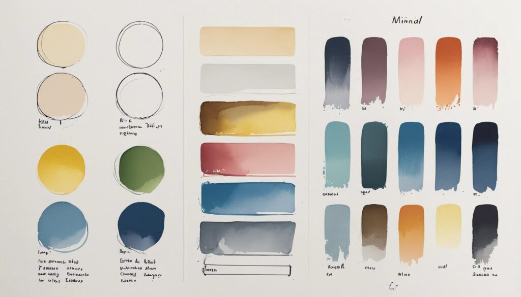
Examples of Award-Winning Website Design Color Palettes
- Metallic Chic: Calm blue gradients with metallic accents (Shopify).
- Deep Vintage Mood: Earthy terracotta, deep blue, and sleek black (Prometheus).
- Cool and Collected: Deep teals and bright metallics (Refire).
- Vibrant but Calm: Muted reds balanced with creamy backgrounds (Loket Design).
- Striking and Simple: Electric blue on smoky black (Bert).
If you’re craving inspiration, peek at the websites that bagged the big awards. Shopify’s metallic chic is a masterclass in making business updates feel like a luxury experience. Prometheus pairs earthy terracotta with deep blue, giving off vintage vibes with a futuristic twist—because, apparently, you can have it all.
Looking for tranquility? Refire’s teals and metallics exude innovation without giving anyone a migraine. Want to break the rules? Loket Design uses muted reds over creams, proving that red isn’t always a warning sign. And if you want to stop visitors in their tracks, Bert’s electric blue on black is a lesson in minimalist drama—think high fashion, but for websites.
These palettes aren’t accidental. They’re the result of testing, audience research, and a willingness to ignore the “safe” option in favor of the “unforgettable.”
Common Mistakes to Avoid with Website Color Schemes
- Overusing trends at the expense of usability.
- Ignoring color accessibility and contrast.
- Letting personal taste override brand needs.
It’s easy to fall in love with whatever’s trending—neon gradients, anyone?—but don’t let this infatuation sabotage your site’s usability. Award-winning website designs may feature bold choices, but they never sacrifice clarity for the sake of style. A beautiful site that’s unreadable is like a sports car with no engine: impressive until you try to go anywhere.
Accessibility is not optional; it’s essential. Low-contrast text might look edgy on your monitor, but it’s a nightmare for users with visual impairments (and for anyone checking your site on a sunny day). If your site fails the squint test, it’s time to rethink your color choices.
Finally, keep your personal preferences in check. Your love for mauve shouldn’t dictate your palette if your brand is all about high-tech innovation. The best website design color palettes are chosen for the audience, not the ego.
Tips for Applying Color Palettes Consistently
- Use hex codes and digital style guides for consistency.
- Leverage design tools to swap palettes efficiently.
- Test color schemes across devices and lighting conditions.
Consistency is the unsung hero of good design. You don’t want your website to look like five designers were fighting over the color wheel. Use hex codes to lock in your chosen colors, and create a digital style guide that details every shade, accent, and use-case for your palette. This isn’t bureaucracy—it’s insurance against design chaos.
Modern design tools let you swap entire themes with a click, making it easy to refresh your look without breaking everything. Take advantage of these features to test how your palette feels in different sections—because what works on the homepage might flop on the contact form.
And please, check your color schemes on different devices and in various lighting conditions. That gorgeous teal might look like seaweed soup under fluorescent lights. Don’t let your masterpiece fall to pieces outside your design cave.
Real-World Impact: Color Schemes and Conversion Rates
- Strategic color use can double form conversions.
- Clear CTAs and contrast drive action.
- Brand recall improves with memorable palettes.
Still not convinced that color matters? Consider this: websites using color strategically have seen form conversions jump by up to 2x. That’s not a typo—just a little color magic, paired with thoughtful design. CTAs that pop (without blinding) and logical color flow guide users straight to the actions you want them to take.
Contrast is your ally, not your adversary. A button that blends into the background is like a chameleon at a lizard convention—impossible to notice and equally ineffective. Make those key elements stand out, and users will thank you (with their clicks, not just their admiration).
Lastly, a strong, consistent palette makes your brand memorable. The next time users spot your signature colors, they’ll remember your site—and that’s half the battle won.
Frequently Asked Questions About Website Color Schemes
- Which colors work best for technology websites?
- How many colors should a website use?
- What are calming and trustworthy color palettes?
- Why is contrast important for readability?
For technology brands, modern blues, grays, and crisp whites remain undefeated—think Apple or Microsoft, not a kindergarten art project. But don’t be afraid to toss in a pop of orange or green to keep things lively.
Three to five colors is the sweet spot for most sites. Any more, and you risk your design looking like a paint factory accident. Stick to a harmonious palette, and let accent colors do the heavy lifting.
If you want to radiate calm and trust, lean on soft blues, greens, and neutrals. These shades lower the heart rate and elevate the perception of reliability—ideal for brands that want to soothe, not startle.
Contrast isn’t just a designer’s obsession; it’s mission-critical for readability. If users have to squint to read your menu, they’ll be gone faster than you can say “bounce rate.”
Conclusion: Make Your Website Color Scheme Unforgettable
Color isn’t just the cherry on top of your website sundae—it’s the whole dessert. Get your website color schemes right, and you’ll create an experience that’s not only visually stunning but psychologically irresistible. The most award-winning website designs leverage color psychology in web design, craft the best color combinations for websites, and apply their website design color palettes with unwavering consistency. Don’t settle for “good enough” when “unforgettable” is within reach. Ready to banish blandness and turn your site into a conversion magnet? Start experimenting, stay bold, and let your colors do the talking. The world doesn’t need another beige website—it needs yours.